

How to Add Captions to IGTV Videos
This step by step guide will show you how to add captions to IGTV Videos

Readable and attractive subtitles are essential to grabbing people’s attention and keeping them engaged. Look at our tips on what elements to consider before adding subtitles to your videos.
Almost everyone is now aware of how important it is to include subtitles on your videos.
Subtitles can increase viewership, drive up SEO rankings, and make your videos more shareable across social media channels.
However, just slapping subtitles on without thought may actually do more harm than good. The text you add needs to seamlessly integrate into the theme of your video and not override the stunning videography you’ve spent hours recording and editing.
Creating readable and attractive subtitles is essential to grabbing people’s attention and keeping them engaged.
So what makes a subtitle effective?
Take a look at our tips on what elements to consider when adding subtitles to videos.
FONT SYTLE
The first element you should consider when adding subtitles to videos is what font style to use.
The most important aspect is for the font to be easily readable by your audience. What makes fonts readable on video? Simplicity and Standardization.
Most practitioners recommend a Sans Serif font style. This means a font with no lines after the characters. The reason? Text overlaid on video reacts differently on the eye than print text. Whereas Serif fonts distort on top of video, San Serif fonts will hold their shape better against moving images.
Some of the most popular San Serif fonts used in subtitling are Universe 45 Light, Antique Olive, Tiresias ScreenFont, and PT Sans. These fonts are known to work well over moving content as they are ultra thin and are devoid of decorative flare.
Using these standardized font styles also help your readability, as your audience is already visually used to seeing them. Therefore it doesn’t require that much brain power to process what they are seeing.
FONT SIZE
Then next thing to consider is font size.
Subtitles are added to help the audience both retain your content better and obtain the content in the first place if they are watching the video without sound. Whilst you don’t want to your video to be overridden by text, you still need the font size to be legible enough for your audience to read it on a mobile device.
To make sure your audience can read your subtitles without difficulty, it is advised to create a mockup of your proposed text size overlaid on the video and view it on every platform you plan to distribute on. This includes watching it on your phone to see how it looks.
Balancing out readability and making sure it doesn’t get in the way of the visuals may take some trial and error, but getting the font size correct is crucial.
COLOR
As we have been reiterating, legibility of your text is key when using subtitles.
Moving images will interact with your overlaid subtitles. If your subtitles start out black over a white tone image, it might look okay; however, a few screens later it might appear on a dark image, that will make the text impossible to read.
So what consistent color text should you use for a background image that might fluctuate between light and dark colors?
The standard recommendation is to use a white color font with a thin black outline. This will make your text readable over any other color and brightness, even against common black and white backgrounds.
PLACEMENT
The positioning of your text is also super crucial. You may be tempted to shove your subtitles as far down to the bottom of your video frame so that the majority of your visual content isn’t disturbed. However, there is huge problem with doing this.
Most web-based video players, YouTube included, use the very bottom tenth of the screen for the video control buttons. If you add your subtile right at the bottom edge, it will get totally missed. Instead it is advised to position your subtitles in the bottom 2/3 of the video, preferably centered.
DURATION
Another element to consider is how long your text should stay on the screen. The best rule of thumb is to leave the subtitle on view 2 seconds longer than it takes you to read it. Anything shorter than that and your audience will not have a chance to comprehend the text, which frankly defeats the purpose of the adding the text in the first place.
Hopefully this post provided you with some valuable insights on what to consider when adding subtitles to your videos.
If you need help transcribing your video to text, then contact us at Happy Scribe. We can save you hours in transcription time.
This step by step guide will show you how to add captions to IGTV Videos
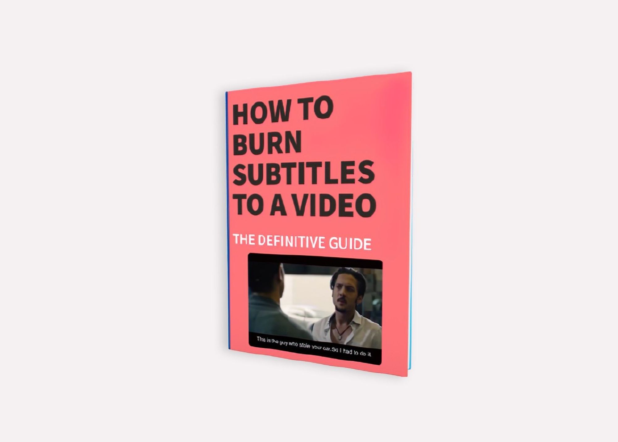
The definitive guide to generating subtitles and captions automatically to your videos and hardcode them directly to your video.

What are the pros and cons of recording and note-taking? Which one is right for you?
Have you ever wondered how to add captions to YouTube videos? Well, this step by step guide will show you how to get accurate captions quickly.

Your subtitles need to be readable and perfectly synced with the video and perfectly follow the reading skills of your audience. For example, you don't make subtitles for adults the same as subtitles for children.

Use Happy Scribe to get a free SRT file for your 30-minute video.

Adding subtitles to videos can increase audience engagement, improve accessibility, and help promote a positive image of a company, making it a useful tool for job postings and promotions.

Dive into the differences between SDH and closed captions, and discover how Happy Scribe can revolutionize your video accessibility with automatic, customizable, and multilingual transcriptions.
Not sure how to add subtitles to a YouTube video? In this article you will find some of the best and easiest ways to add captions to videos.

Do you need Spanish subtitles for your videos? Learn how to translate and transcribe English audio quickly while maintaining contextual accuracy.