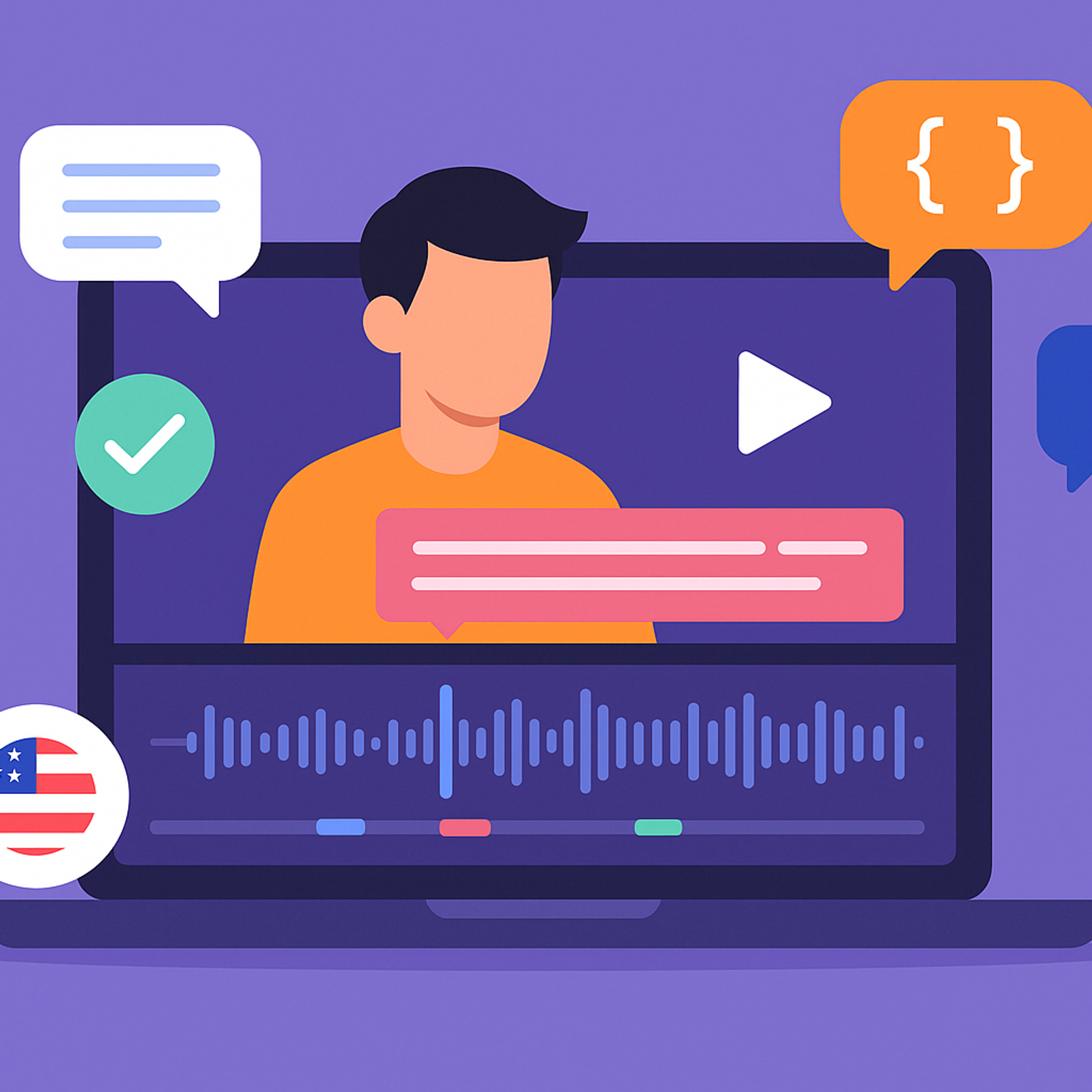
5 Best Fathom Alternatives for AI Meeting Notes [2026]
The 5 best Fathom alternatives for AI meeting notes in 2026, compared by accuracy, pricing, languages, and features.
 Biplab Mazumder
·
15 min read
Biplab Mazumder
·
15 min read
The 5 best Fathom alternatives for AI meeting notes in 2026, compared by accuracy, pricing, languages, and features.
Biplab Mazumder
·
15 min read
Find the best Bluedot alternative for your team. From bot-free AI to 95% accuracy and 150+ language support, here are the top picks.
Biplab Mazumder
·
16 min read
Looking for a secure AI notetaker? Compare the best SOC 2 Type 2-compliant tools for bot-free recordings, multilingual support, and meeting summaries.
Biplab Mazumder
·
12 min read
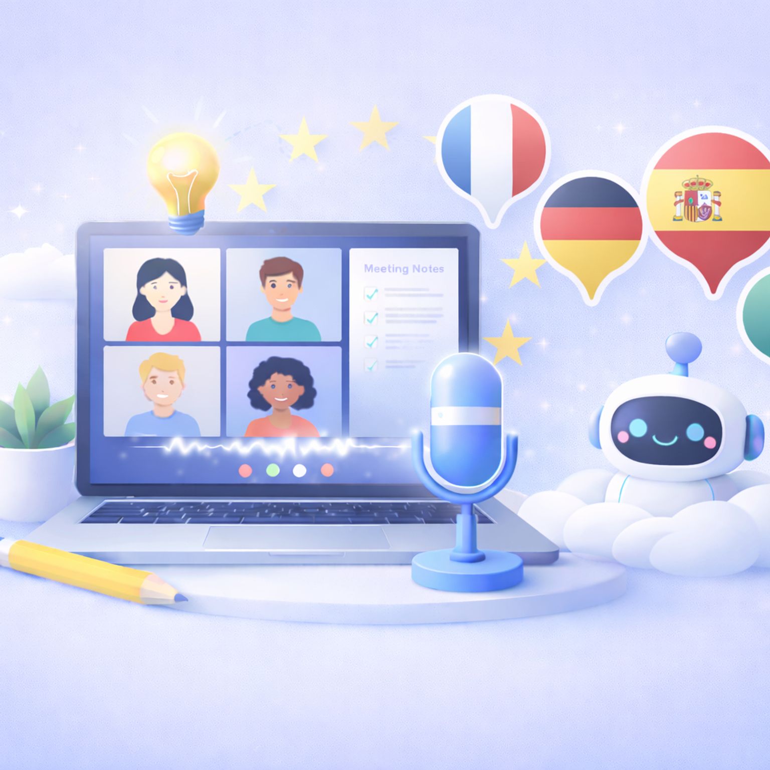
MeetGeek not keeping up? We've picked 5 alternatives that offer better accuracy, stronger language support, and more control over your meeting notes.
 Rodoshi Das
·
15 min read
Rodoshi Das
·
15 min read
Tired of MS Copilot's limitations? Explore the 5 best Copilot alternatives for AI meeting notes that are accurate, affordable, and flexible.
Biplab Mazumder
·
16 min read
In-person meetings are the hardest to document. We tested 5 AI note takers so you don't have to find out the hard way.
Rodoshi Das
·
12 min read
The 5 best Leexi alternatives, compared by accuracy, pricing, and features, so you can pick the right AI note taker.
Biplab Mazumder
·
15 min read
When Notion AI's text summaries fall short, you need a specialized meeting assistant. Compare the top 5 alternatives to capture precise audio and video.
Biplab Mazumder
·
16 min read
Struggling with GDPR-compliant transcription? We shortlisted the best transcription software in Europe. Find out our top picks!
Rodoshi Das
·
11 min read
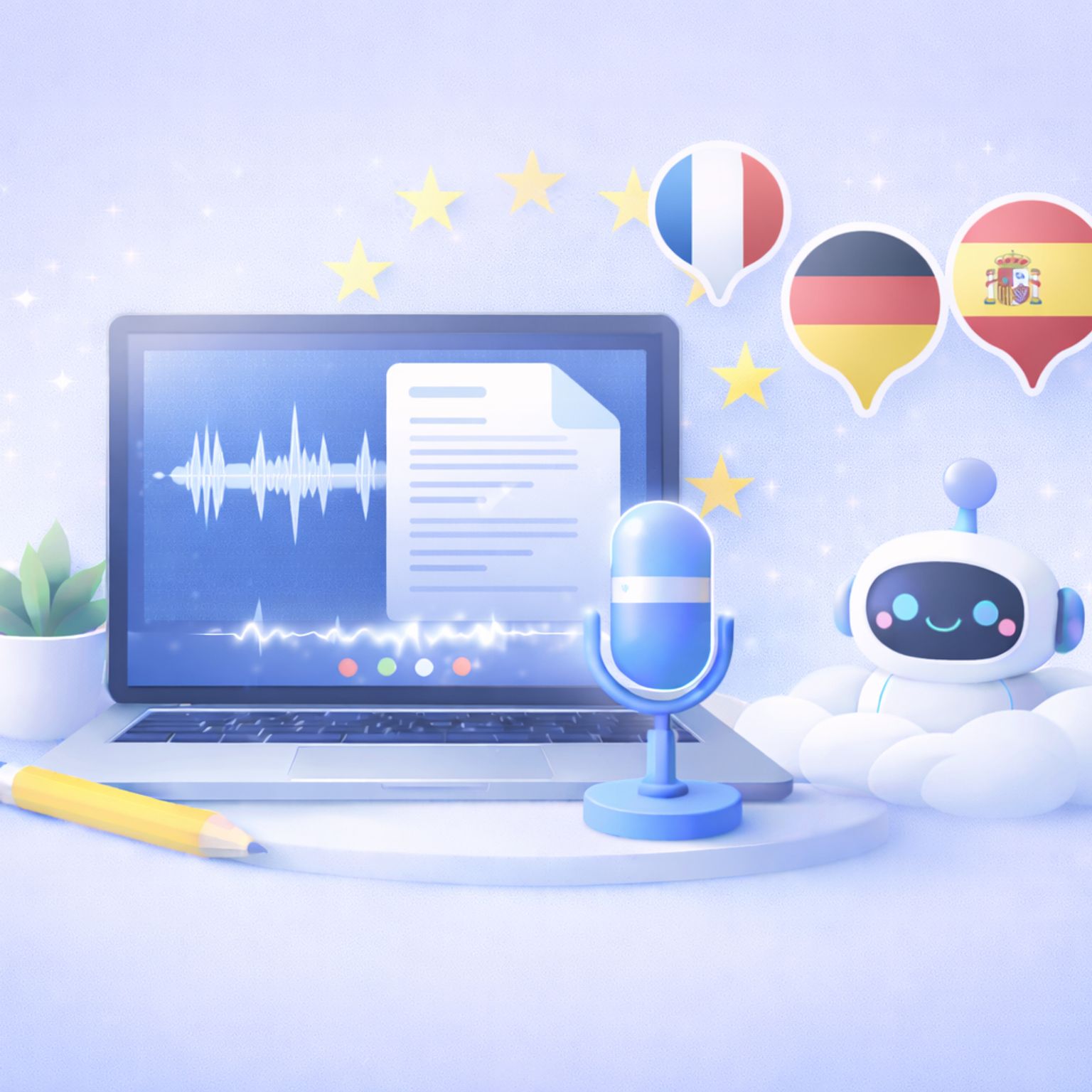
Looking for the best AI meeting assistants in Europe? Compare top GDPR-compliant tools with EU data storage and multilingual support.
Rodoshi Das
·
11 min read
Tired of Jamie's strict meeting limits and missing audio playback? Compare the best Jamie alternatives for secure transcripts and verifiable meeting notes.
Biplab Mazumder
·
16 min read
Connect HappyScribe's MCP server to your AI assistant and access your transcriptions, meeting notes, and subtitles directly from Claude, ChatGPT, and more. Step-by-step setup guide included.
 André Bastié
·
4 min read
André Bastié
·
4 min read
I tested the best bot-free AI note takers. Compare features, privacy, pricing, and see which tool fits your workflow best.
Rodoshi Das
·
12 min read
Looking for a better AI note taker? We tested the top Sembly AI competitors for transcription accuracy and pricing to help your team choose wisely.
Biplab Mazumder
·
15 min read
Your meetings deserve better notes. Compare the 5 best AI meeting assistants on accuracy, language support, and privacy.
Rodoshi Das
·
12 min read
Explore the best Circleback alternatives for 2026. Compare features, pricing, privacy, and language support to find the right AI note taker for your workflow.
Rodoshi Das
·
12 min read
Looking for better Krisp Alternatives? Compare top tools for meeting notes, multilingual transcription, and in-person recording. Find your best fit.
 Akshay Kumar
·
9 min read
Akshay Kumar
·
9 min read
Need accurate meeting notes without violating EU privacy laws? Compare the 5 best GDPR-compliant AI note takers of 2026 and find the right fit for your team.
Biplab Mazumder
·
12 min read
Looking for a better AI note taker? Compare the top 5 Sonix alternatives for seamless meeting capture, 95%+ accuracy, and transparent monthly pricing.
Rodoshi Das
·
16 min read
Compare the best free AI note takers: HappyScribe, Fathom, Tactiq, tl;dv, and Otter. See free plan limits, accuracy, language support, recording modes, and privacy and pick the right fit.
Rodoshi Das
·
12 min read
Looking for the best Grain alternatives? Discover 5 AI note-takers offering 95% accuracy, global translations, and seamless CRM integrations.
Biplab Mazumder
·
15 min read
Looking for a Read AI alternative? Compare the best 5 tools for secure and accurate AI meeting notes, featuring HappyScribe, Fellow, and Fireflies
Biplab Mazumder
·
14 min read
Looking for the best Fireflies alternatives? Discover top AI meeting note tools like HappyScribe, Fathom, and Fellow for secure and accurate transcripts
Biplab Mazumder
·
15 min read
Looking for Otter alternatives? Compare the top 5 tools for AI meeting notes and discover why HappyScribe is the best one for security and accuracy.
Rodoshi Das
·
12 min read
Tired of Notta's recording limits and surprise charges? Switch to these 5 reliable AI note-takers for safer data and 95% accurate transcripts.
Rodoshi Das
·
13 min read
Compare the top AI note-taking tools for Zoom in 2026. See features, pricing, language support, integrations, and security to find the best fit for your team.
Akshay Kumar
·
9 min read
From multilingual calls to noisy rooms, discover AI note-takers for Google Meet that summarize, highlight action items, and keep your team on track.
Akshay Kumar
·
10 min read

Compare the best AI note takers for market researchers. Explore their transcription accuracy, language support, security, and pricing details.
Rodoshi Das
·
12 min read

From AI drafts to human review, this guide breaks down real transcription services' turnaround times, costs, and risks. Make the right choice today.
Akshay Kumar
·
6 min read
Looking for a better AI note taker? Compare the top 5 tl;dv alternatives for 2026. Find the right fit for global teams, sales workflows, and privacy
Biplab Mazumder
·
13 min read
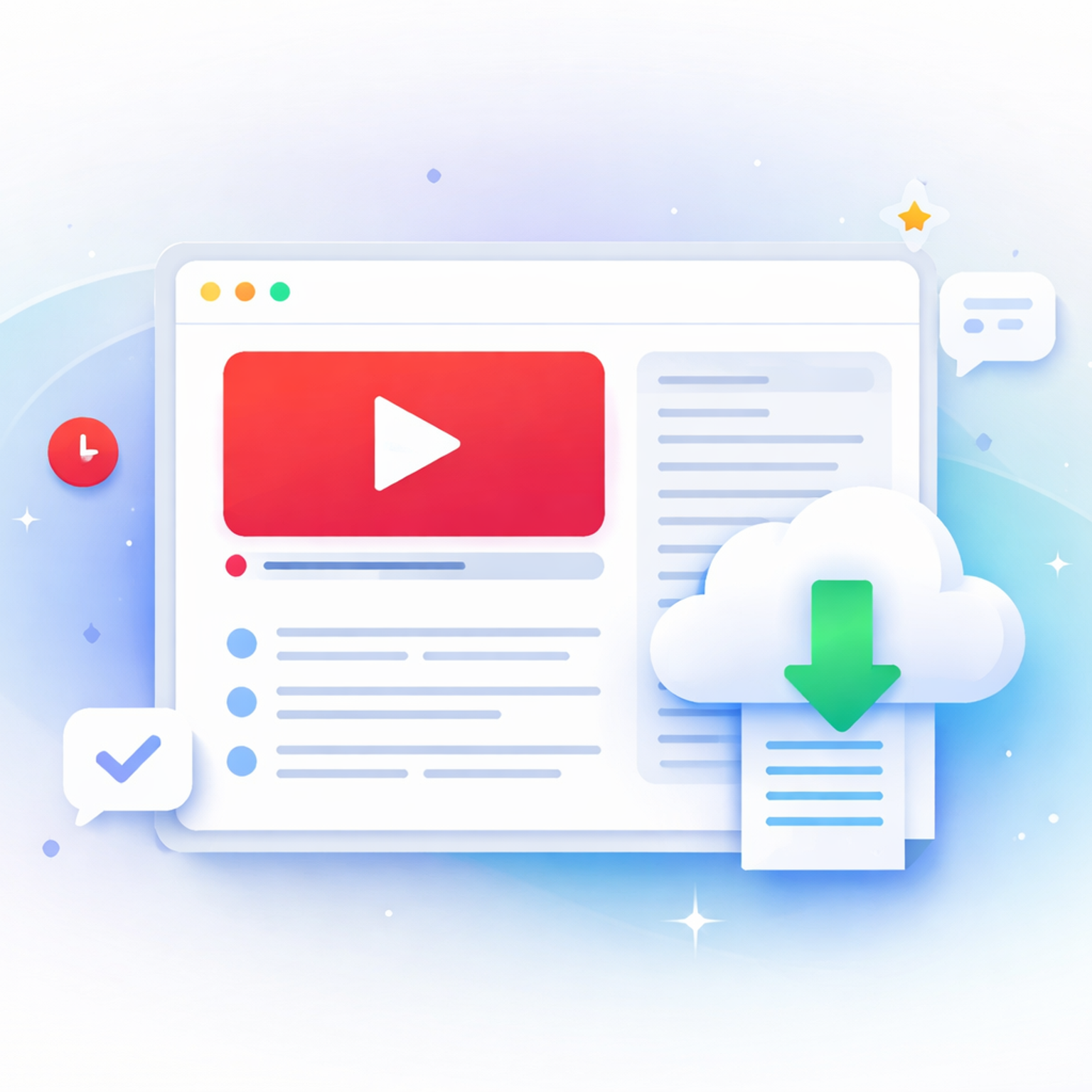
Struggling to download a YouTube transcript? Compare free methods, tools, and when HappyScribe is the better choice for accurate, reusable text.
Rodoshi Das
·
6 min read
Looking for a European AI note taker? We tested GDPR-compliant tools with EU hosting, strong accuracy, and real-world workflows.
Biplab Mazumder
·
10 min read
Compare the best AI note takers for journalists in 2026. See which tools work best for interviews, accuracy, security, and workflows.
Rodoshi Das
·
10 min read
Turn talk into action. Discover the best meeting agenda apps for 2026 that combine smart planning, AI recording, and automated task tracking.
Rodoshi Das
·
9 min read
Learn how to write an objective summary with AI, plus examples, best practices, and tools to keep summaries factual and unbiased.
Rodoshi Das
·
8 min read
Understand how speaker labels and timestamps impact transcription and factors that slow down transcription.
Rodoshi Das
·
6 min read
Compare the best AI note takers for business leaders. See which tools handle accuracy, languages, privacy, and scale best in 2026.
Biplab Mazumder
·
10 min read
A comparison of the best AI note takers for content managers. See which tools reduce editing, rewriting, and manual structuring across Teams, Zoom, and Meet.
Akshay Kumar
·
9 min read
Compare the best AI note takers for Microsoft Teams. See how they handle recording, summaries, security, and sharing and find the right one for you.
Akshay Kumar
·
8 min read

Learn how to create transcript from video quickly and accurately. Follow our simple steps to turn any video into searchable, editable text using HappyScribe.
Akshay Kumar
·
6 min read
Struggling with messy AI transcripts? Discover the 6 key factors that impact transcription accuracy and how to engineer better results today.
Rodoshi Das
·
8 min read
 Rodoshi Das
·
6 min read
Rodoshi Das
·
6 min read
 Rodoshi Das
·
13 min read
Rodoshi Das
·
13 min read

Looking for the best lecture recorder for students? I tested HappyScribe, Otter, OneNote, and others to see which app is accurate and creates the best study guides.
Rodoshi Das
·
9 min read
In depth review of Sonix, the transcription service: pros, cons, and features overview from actual users.
André Bastié
·
6 min read
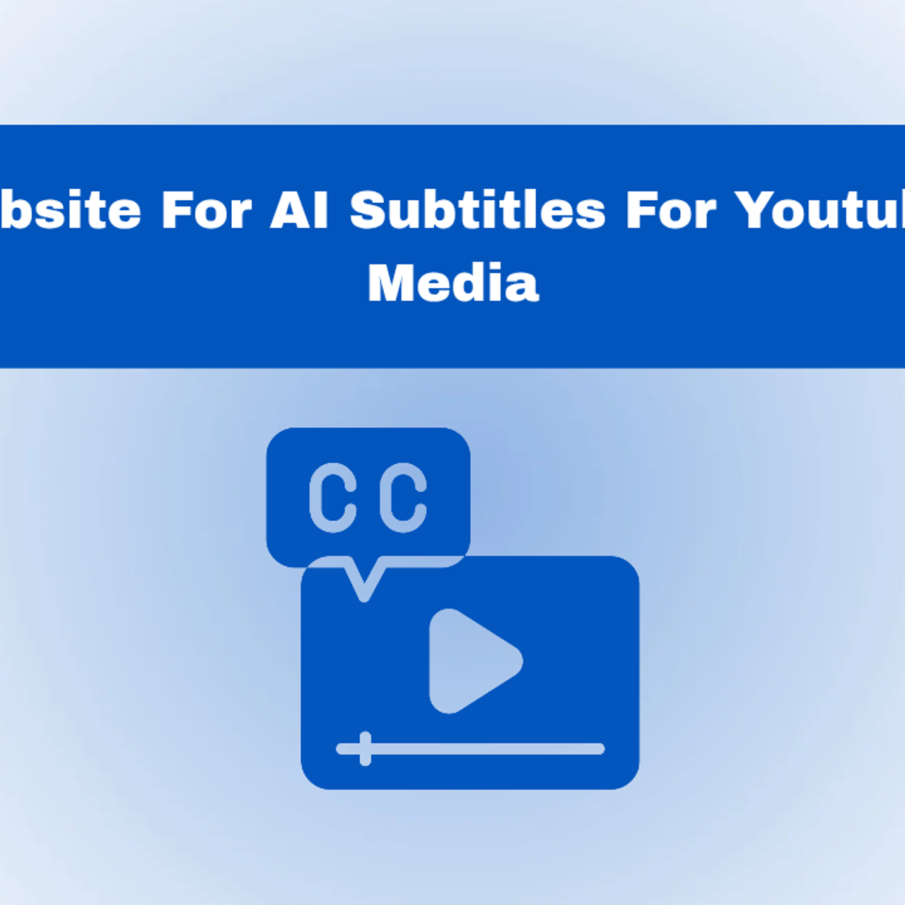
Find the best AI subtitle generator websites for YouTube and social media. HappyScribe reviews the best tools in the market to add subtitles and much more.
André Bastié
·
13 min read
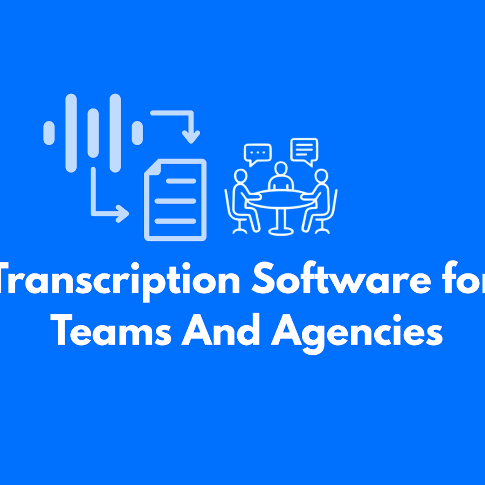
We reviewed the top transcription software for teams and agencies to help you work faster and stay organized. See the best tools for smooth collaboration.
André Bastié
·
21 min read
Discover the top Any2Text alternatives for accurate transcription, subtitles, and workflows in 2026. Compare the best tools and pick the right upgrade.
Akshay Kumar
·
8 min read
Secondary market research saves time and money by using existing data to validate demand and uncover insights. Learn how to leverage it effectively.
Akshay Kumar
·
7 min read
Learn when recording without consent is legal, when it isn’t, and how privacy laws differ by state. Understand the rules before you hit record. Read now.
Akshay Kumar
·
5 min read

Learn how to record Microsoft Teams meetings in 2026 and discover an easier way to save, transcribe, and manage calls with HappyScribe’s AI meeting recorder.
Rodoshi Das
·
6 min read
Compare the best podcast transcript generators for 2026 and see why HappyScribe is the top pick for accuracy, SEO, and repurposing.
Rodoshi Das
·
8 min read
Explore the top AI scribe tools and see how they improve clinical documentation, reduce charting time, capture meeting recordings, and ensure full security
Rodoshi Das
·
7 min read

Is HappyScribe worth it? Here’s an honest review of its features, pricing, real use cases, and limitations to help you decide if it’s right for you.
Rodoshi Das
·
9 min read
We tested the 5 best AI meeting note takers for teams and client calls, discover which tools deliver the most accurate summaries and boost productivity.
André Bastié
·
10 min read
Discover the best podcast transcription software for 2026, including HappyScribe, Adobe Podcast, Descript, and more.
Rodoshi Das
·
8 min read
Check out 2026’s best speech-to-text tools. Full review of strengths, weaknesses, and who they suit best. Save time and choose wisely!
Rodoshi Das
·
8 min read

Looking for media transcription services that save time and stay accurate? Find top platforms with quick turnaround and reliable 2026 results.
Akshay Kumar
·
8 min read
Level up your 2026 creator workflow with 9 essential AI tools for transcription, editing, voiceovers, and distribution to publish more content in less time
Rodoshi Das
·
11 min read
Review top court transcription tools for legal professionals. See how HappyScribe and other tools handle accuracy, security, and speed.
Rodoshi Das
·
7 min read

Need a quick YouTube transcript? Compare the best methods and see how HappyScribe delivers the most accurate transcripts for creators and students.
Rodoshi Das
·
5 min read

Need a transcript maker that actually saves time? See which platforms deliver accuracy, speed, and clean editing workflows in 2026. Read the full guide.
Akshay Kumar
·
8 min read
Explore the top alternatives to Notta for accurate audio-to-text, smarter AI meeting notetakers, and more powerful workflows. Compare the best tools now.
Akshay Kumar
·
6 min read
Explore the best Veed alternatives for transcription, subtitles, and social-style editing. Find the right tool for your workflow today.
Akshay Kumar
·
10 min read
Stop wasting hours transcribing. We tested the 7 best AI transcription tools for accuracy, speaker ID, and language support. Find your fit here.
André Bastié
·
11 min read
We compared Happy Scribe, Rev, Sonix, and Descript so you don’t have to. Here’s the ultimate AI transcription breakdown to help you choose the best fit.
André Bastié
·
15 min read
HappyScribe offers highly accurate AI Subtitles and easy video translation in 120+ languages. Use the intuitive Subtitle Editor to polish timing and export to SRT or VTT files.
André Bastié
·
10 min read
Explore the top AI meeting note takers for 2025, including HappyScribe, Jamie, Tactiq, Fireflies, and Otter. Discover their features, pros, and cons.
André Bastié
·
15 min read
Discover the top Rev alternatives for 2026 - faster AI transcription, lower costs, multilingual support, subtitles, and better collaboration for modern teams.
Akshay Kumar
·
7 min read
Explore the best free audio transcription tools in 2026, from free plans to secure free trials. Compare HappyScribe, Gladia, MacWhisper, and more.
Rodoshi Das
·
8 min read

Looking for a quick way to summarize YouTube videos? Learn how to do it in seconds and compare the top AI tools for fast and reliable summaries.
Rodoshi Das
·
6 min read

AI tools for journalists must have a specific set of features to help you. HappyScribe reviews the best transcription tools for journalists available in the market.
Rodoshi Das
·
8 min read
Explore the best Descript alternatives in 2026. See how top platforms differ, where they fit, and which one aligns with the way you work. Read the guide.
Akshay Kumar
·
13 min read
Looking for a Clideo alternative? Compare top tools with better transcription accuracy, multilingual captions, and AI-powered workflows built for professionals.
Akshay Kumar
·
8 min read
Discover the 5 best business transcription services that turn meetings, client calls, and media recordings into accurate, secure, and ready-to-use transcripts.
Rodoshi Das
·
7 min read
Reach global audiences with the best AI video translator tools like HappyScribe, Rev, Smartcat, Maestra AI, and Wavel AI for accurate subtitles and voiceovers.
Rodoshi Das
·
7 min read
Explore the 5 best audio translator tools in 2026, including HappyScribe, VEED, DeepL Voice, and more, for accurate and secure multilingual audio translations
Rodoshi Das
·
5 min read
Compare TurboScribe alternatives like HappyScribe, Descript, Otter.ai, and Maestra AI to streamline transcription, translation, subtitling, and workflows.
Akshay Kumar
·
7 min read
What’s the ultimate best AI notetaker? I tested the two crowd favorites, Otter AI and HappyScribe, to see which one is the complete package.
André Bastié
·
7 min read

Discover the top Trint alternatives for 2026. Compare HappyScribe, Otter.ai, Descript, Rev, and Sonix for accuracy, pricing, and professional workflows.
Akshay Kumar
·
8 min read

Looking for video to text software? Compare HappyScribe, Otter, VEED, Notta, and Tactiq, and see which one’s the best fit for your workflow.
Rodoshi Das
·
5 min read
I tested 10+ AI note taking so you don't have to. Here are the best ones that deliver high-quality notes without compromising on privacy.
Rodoshi Das
·
15 min read
Find the 5 best professional subtitling services in 2026. Compare HappyScribe, Rev, Amberscript, and more to find accurate, accessible, and compliant solutions.
Rodoshi Das
·
7 min read

Discover the top 6 human transcription services that offer high accuracy, data security, and expert-reviewed transcripts across industries.
Rodoshi Das
·
8 min read
Discover the best audio and video trimmers in 2026: free and paid. Compare speed, precision, formats, and features to cut, merge, and export clips fast.
André Bastié
·
5 min read
Compare the top 5 AI transcription tools based on features, pricing, accuracy, languages, and exports so you can pick the best option fast.
André Bastié
·
5 min read
Discover the top 5 online voice recorders for 2026: free & paid. Compare audio quality, recording limits, formats, and collaboration to choose the best tool.
André Bastié
·
5 min read
Discover the 5 best subtitle generators in 2026: HappyScribe, Veed, Canva, Sonix and Descript. Compare features, pricing, languages, accuracy to choose yours.
André Bastié
·
9 min read
In this guide, we’ll explore the best free audio summarizer tools for 2026 (MP3 summarizers and AI-powered platforms built for meetings and podcasts. HappyScribe stands out as the best solution for professionals and students.
André Bastié
·
5 min read
AI transcription software uses automatic speech recognition (ASR) to convert spoken words into accurate, editable text within minutes. In this article, you’ll discover the best AI transcription tools in 2026.
André Bastié
·
5 min read
In this guide, we’ll break down what YouTube video summarizers do, compare the best video summarizer AI tools available in 2026.
André Bastié
·
5 min read
This guide compares the top free (and freemium) options, outlines what features matter most, and shows why HappyScribe continues to be one of the most accurate and versatile AI-powered transcript generators available today.
André Bastié
·
5 min read
In this guide, you’ll learn how these extensions work, what features matter, which add-ons are worth installing, and when it’s smarter to switch to a full transcript service like HappyScribe for better accuracy, formatting, and export options.
André Bastié
·
5 min read

This guide will show you the easiest and most accurate ways to extract transcripts from YouTube videos for free, introduce the best tools available, and explain how HappyScribe stands out as a top solution for both free and professional transcription needs.
André Bastié
·
3 min read
In this guide, we’ll compare the best free YouTube transcript tools, show you how to download YouTube transcripts, and explain why HappyScribe stands out as one of the most accurate and flexible options in 2026.
André Bastié
·
4 min read
HappyScribe is a professional and efficient audio to text tool for businesses and content teams. Want to test it for yourself? Get started with a free trial.
André Bastié
·
5 min read
Learn how to transcribe voice recordings to text quickly with AI tools. Convert lectures, interviews, and meetings into searchable documents. Step-by-step guide + tips for students, journalists, and professionals.
André Bastié
·
12 min read
Google Meet has become a go-to tool for seamless online communication, whether you’re hosting a team meeting or a global webinar. But when it comes to documenting discussions and decisions, automation can save you time and effort while ensuring accuracy.
 Niek Leermakers
·
8 min read
Niek Leermakers
·
8 min read

AI transcription has revolutionized the way we document Google Meet conversations, providing speed and accuracy that far outpace traditional methods. In this guide, we’ll walk you through the steps to set up and leverage AI-powered tools like Happy Scribe to transcribe your meetings effortlessly and efficiently.
Niek Leermakers
·
7 min read

Research suggests that millennials and Gen Z viewers have made captions and subtitles a regular part of their viewing experience, both by choice and sometimes out of necessity. This article discusses the trends and benefits of captions and subtitling for younger audiences.
 Henni Paulsen
·
5 min read
Henni Paulsen
·
5 min read

In this article, you’ll learn how meeting transcription services can streamline your production workflow, ensure nothing gets lost in translation. We’ll explore the advantages, limitations, and key factors to consider, helping you decide if transcription tools are the right choice for your media projects.
Niek Leermakers
·
7 min read
In this article, you’ll learn the key differences between verbatim and edited transcription and how to decide which one best suits your needs.
Niek Leermakers
·
5 min read
In this article, you’ll learn how to efficiently convert video content into text, whether for accessibility, SEO, or broader audience engagement. We’ll explore top tools like Happy Scribe, and offer practical tips for ensuring accurate and high-quality transcriptions to make your content conversion process smooth and effective.
Niek Leermakers
·
6 min read

In this article, we’ll walk you through the differences between VTT and SRT subtitle formats, so you can pick the one that works best for your video. Whether you’re after sleek, styled captions or just need something simple and widely compatible, we’ve got you covered!
Niek Leermakers
·
6 min read
A comprehensive guide on understanding Spotify for podcasters, from submission to promotion.
Niek Leermakers
·
18 min read
This article provides a comprehensive guide on how to convert video content into text. It discusses the basics of video content conversion, the benefits, the top tools for transcription like HappyScribe, and offers tips and tricks.
Niek Leermakers
·
8 min read
In this article, we’ll dive into why subtitles are important for your Instagram Reels and how they can improve your content. You’ll learn how tools like Happy Scribe can help you easily add captions to your videos, making them more accessible and engaging for a bigger audience.
Niek Leermakers
·
6 min read
How can someone tell whether MT is accurate or not? This article explores the different ways in which MT accuracy is evaluated, listing a range of metrics and approaches that are used to gauge quality, both based on human expertise and automated metrics.
Henni Paulsen
·
5 min read
In this article, you’ll discover how using a solution like Happy Scribe’s AI- and human-assisted transcription can drastically cut down production time while boosting the quality of your transcriptions. Learn how accuracy in ASR (Automatic Speech Recognition) is measured, what factors influence it, and how every improvement translates to time savings and better content workflows.
Henni Paulsen
·
8 min read

An analysis of eye movements as people read subtitles? That sounds like scientific experimentation, but in fact, researchers are using viewing patterns, or “eye tracking technology,” as a tool to make subtitling more effective. This article provides an overview of how researchers are using this information to better understand what viewers focus on while watching a screen, including text, images, and other visual cues. Researchers then apply this knowledge to improve subtitle placement, formatting, timing and more!
Henni Paulsen
·
5 min read

Shot changes - transitions between different camera angles, scenes, or locations - are fundamental to storytelling in video, but also pose unique challenges for subtitling. We’ll dive deep into what shot changes are exactly and why they’re super important for providing top-quality subtitles.
Henni Paulsen
·
4 min read
Happy Scribe's Quality Centre ensures high-quality, distribution-ready subtitles and transcripts with minimal revisions. Our Quality Centre, featuring subtitling Style Guides and Glossaries, also includes advanced settings like subtitle timing presets, transcription customizations, and more.
Niek Leermakers
·
3 min read
With the Gen 2 Model from the voice-to-text technology startup, the time to refine subtitles is reduced by 13%, and the error rate drops by 8%. "This will be a game-changer for content creators worldwide."
Niek Leermakers
·
3 min read
Discover why the Web Content Accessibility Guidelines (WCAG) are crucial for subtitling and transcription, helping media companies ensure inclusivity and reach a wider audience. This article explains how WCAG standards support the deaf and hard-of-hearing community with high-quality, accurate subtitles. Learn how following these guidelines can improve your content’s accessibility and create a more inclusive digital experience. Written by Henni Paulsen, June 2024.
Henni Paulsen
·
5 min read
In this article, you'll learn all about the European Accessibility Act (EAA) and its requirements for making audiovisual content accessible through subtitles and captions. It also explains how automating the subtitling process can save you time and money, improve accessibility, and engage a broader audience. Article written by Henni Paulsen, June 2024.
Henni Paulsen
·
5 min read
Meet Happy Scribe at GALA's signature event for the globalization and localization industry, on 21-23 April 2024 in Valencia, Spain.
André Bastié
·
2 min read
In this article we explain the differences between adapting and translating your subtitles. Find out what works best for your audiovisual content!
 Boris Simonse
·
5 min read
Boris Simonse
·
5 min read
This article examines the complexities of creating effective and accurate SDH subtitles, highlighting the technical, linguistic, and cultural challenges involved in making media content accessible and inclusive for all viewers.
Niek Leermakers
·
6 min read

This article explores SDH subtitling as a complex art that enriches the viewing experience for the deaf and hard of hearing by blending dialogue, sound effects, and emotional depth. It discusses foundational aspects, methods, obstacles, and technological advancements in SDH subtitling, emphasizing the critical roles of precision, timing, and comprehensive audio cues, and anticipates the use of AI and cloud technology to improve subtitling accessibility and efficiency.
Niek Leermakers
·
6 min read

This article provides a step-by-step guide on creating SDH subtitles for movies, offering tips and techniques on how to make them accessible and visually appealing to viewers.
Niek Leermakers
·
6 min read
Happy Scribe is thrilled to announce a new partnership with GALA, The Globalization and Localization Association, where Happy Scribe provides English subtitling services for GALA’s videos in 2024.
André Bastié
·
2 min read

This blogpost discusses three simple methods for SaaS companies to convert audio to text. It highlights the benefits of using transcription services, automated speech recognition software, and manual transcription. The post aims to help SaaS companies save time and improve their productivity.
Niek Leermakers
·
7 min read

This article compares the effectiveness of AI and human subtitling for educational and academic content. It explores the pros and cons of each approach, highlighting the accuracy, efficiency, and cost factors. Ultimately, it poses the question of which method is more efficient for accurate subtitling in educational contexts.
Niek Leermakers
·
6 min read
Video content plays a crucial role in acquiring customers. It helps businesses engage with their target audience effectively and showcase their products or services. Videos are more engaging and informative, making them a powerful tool for customer acquisition. Marketers should prioritize creating high-quality video content to drive growth and conversions.
Niek Leermakers
·
11 min read

Subtitles in virtual classes can enhance accessibility and learning experiences. Use clear fonts and colors, place them at the bottom of the screen, and ensure accurate captions. Encourage students to provide feedback on subtitle preferences and make adjustments accordingly.
Niek Leermakers
·
9 min read

This blog post explores the challenges and opportunities in using AI for subtitling in language services. It discusses how human expertise and AI can be combined to improve efficiency and accuracy in subtitling, highlighting the importance of finding the right balance between human and machine capabilities.
Niek Leermakers
·
7 min read

Subtitling educational videos in universities can benefit multilingual audiences in various ways. It improves comprehension, allows non-native speakers to follow along, supports accessibility for the deaf and hard of hearing, and aids in language learning. Subtitles also enable better retention of information and create a more inclusive learning environment.
Niek Leermakers
·
7 min read

This blog post discusses the evolution of subtitling technology and its implications for higher education. It explores how advancements in technology have made subtitling more accessible and accurate, benefiting both students and educators. The post also highlights the potential impact of these advancements on language learning and accessibility in education.
Niek Leermakers
·
9 min read

This blogpost discusses the potential benefits of real-time subtitling for academic events and seminars. It highlights the accessibility and inclusivity advantages, as well as the potential for enhancing understanding and engagement among attendees. The post also considers the challenges and solutions for implementing real-time subtitling technologies.
Niek Leermakers
·
9 min read
This blogpost emphasizes the significance of cultural sensitivity in subtitling for international students in universities. It highlights the need to consider cultural nuances and adapt subtitles accordingly to ensure effective communication and understanding.
Niek Leermakers
·
8 min read

This blogpost discusses the importance of providing subtitles in education to make it fair for students in international schools and universities. It highlights the benefits of subtitles for students with hearing impairments and those who speak English as a second language.
Niek Leermakers
·
8 min read

This blog post discusses the benefits of using subtitles in research and conference videos to make them accessible and shareable worldwide. Subtitles can help overcome language barriers and improve accessibility for individuals with hearing impairments, making the content more inclusive and reaching a broader audience.
Niek Leermakers
·
8 min read

This blogpost discusses the importance of subtitles in making academic and educational videos accessible to a wider audience. It explores the benefits of subtitles and provides tips on how to effectively add subtitles to videos.
Niek Leermakers
·
5 min read

Automated subtitles offer a cost-effective and time-saving solution in education. They enhance accessibility for students with hearing impairments and second language learners.
Niek Leermakers
·
9 min read
This blog post highlights the importance of using captions for companies in various contexts. It emphasizes how captions can enhance accessibility, engagement, and search engine optimization. Additionally, it discusses the features and benefits of using Happy Scribe, a captioning and transcription tool.
Niek Leermakers
·
7 min read

This blogpost discusses the potential of AI subtitling in global media to enhance multilingual accessibility. It explores the benefits of AI technology for improving accuracy, speed, and cost-effectiveness in creating subtitles. The future looks promising for leveraging AI in making content more accessible across languages.
Niek Leermakers
·
8 min read

Controlling language quality in AI-powered subtitling is important for accurate and effective communication. This blog post provides tips on how to maintain high language standards, including training the AI model with quality data, using proper punctuation and grammar, and regularly reviewing and refining the subtitles.
Niek Leermakers
·
6 min read
This blogpost discusses how artificial intelligence (AI) is being utilized to expedite subtitling in language services. It explores various AI techniques and tools that are employed to automate and improve the subtitling process, resulting in faster and more efficient translation and localization services.
Niek Leermakers
·
5 min read

This blog post explores the various aspects of professional captioning workflows. It covers topics such as best practices, tools, and technologies involved in captioning, making it a valuable resource for professionals in the captioning industry.
Niek Leermakers
·
8 min read
This blog post discusses the impact of Automatic Speech Recognition (ASR) and Machine Translation (MT) on subtitling. ASR and MT technologies have made subtitling more efficient and accurate, but there are still challenges such as accuracy, style, and cultural context that need to be addressed.
Niek Leermakers
·
7 min read
This blogpost provides insights into the media localization sector, with a focus on subtitling and captioning. It discusses the industry's growth and the importance of these services in reaching global audiences. The post also covers trends, challenges, and best practices for content localization in the fast-evolving media landscape.
Niek Leermakers
·
8 min read

Business transcription involves converting audio or video recordings of meetings, interviews, or market research into written text. This service provides accurate records that can be easily referenced, shared, or analyzed, saving time and improving productivity for businesses.
Niek Leermakers
·
9 min read
This blogpost explains how AI-driven subtitling can enhance the efficiency and accuracy of language service providers. By automating the subtitling process, AI technology can save time and reduce errors, leading to improved productivity and customer satisfaction.
Niek Leermakers
·
7 min read

Advanced captioning is revolutionizing the language industry by providing accurate and real-time translations of spoken content into text form. This technology is benefiting various sectors, including media, education, and accessibility services, by making audio and video content more inclusive and accessible to a wider audience.
Niek Leermakers
·
8 min read
This blog post offers tips and tricks for language professionals on how to create perfect captions. It provides helpful insights on crafting engaging and effective captions that enhance the communication and impact of their work.
Niek Leermakers
·
8 min read

This blogpost discusses the impact of machine learning and AI on subtitling services, highlighting the benefits of these technologies in improving accuracy and efficiency. The use of advanced algorithms and automated processes is revolutionizing the language services industry.
Niek Leermakers
·
8 min read

This blog post discusses the increasing importance of subtitling and captioning in multilingual media. It highlights their role in ensuring accessibility, reaching broader audiences, and improving understanding. Subtitles and captions have become essential tools for media creators to engage viewers from different languages and cultures.
Niek Leermakers
·
9 min read

This blogpost offers helpful tips for language service providers to improve subtitling services. Topics include timing, length, readability, accurate translations, and software tools. Following these tips can enhance the overall quality and experience of subtitles for viewers.
Niek Leermakers
·
9 min read

Finding the best transcription services for research projects can be a daunting task. However, three top choices include Rev, TranscribeMe, and GoTranscript. Rev offers accurate transcriptions with quick turnaround times, while TranscribeMe specializes in high-quality voice-to-text services. GoTranscript provides affordable options with multiple file formats supported.
Niek Leermakers
·
9 min read
AI technology is revolutionizing the field of subtitling, allowing for personalized and customized solutions in language services. By utilizing AI, companies can provide accurate and tailored subtitles that meet individual needs and preferences, enhancing the overall viewer experience.
Niek Leermakers
·
8 min read
At Happy Scribe we have a team of 6 Product Engineers building and maintaining a web application that serves 500k users per month. One of our secret tools: Ruby on Rails.
 Martí Serra
·
6 min read
Martí Serra
·
6 min read
This blog post discusses the benefits of using cloud-based and software platforms for subtitling, such as increased efficiency, accessibility, and collaboration capabilities. These platforms can streamline the subtitling process and improve overall productivity for content creators.
Niek Leermakers
·
9 min read
This blogpost explains Vimeo's fee structure for creators, highlighting the different membership options and the costs associated with each. It provides a clear breakdown of pricing and features, helping aspiring creators make informed decisions about their video hosting platform.
Niek Leermakers
·
5 min read
Zoom meetings are now essential; transcripts enhance efficiency and accessibility.
Niek Leermakers
·
6 min read

To download a video from Vimeo, you can use various online tools such as SaveFrom.net, KeepVid, or ClipConverter. These tools allow you to copy the video's URL and paste it into their platform to download the video in your desired format.
Niek Leermakers
·
5 min read

In this article, we’ll break down everything you need to know about Zoom Cloud—how it works, its features, and a few common issues you might run into, along with tips to solve them. Let’s dive in!
Niek Leermakers
·
4 min read

Yes, Zoom has a feature called Closed Captioning that can display translated subtitles. Hosts or participants can enable this feature and select the language for the subtitles. It's a useful tool for multilingual meetings or webinars.
Niek Leermakers
·
7 min read

This blog post provides a step-by-step guide on how to translate subtitles on Zoom. It covers the process of enabling the real-time transcription feature, selecting the language for translation, and adjusting subtitle settings for optimal viewing. Helpful tips and troubleshooting suggestions are also included.
Niek Leermakers
·
6 min read

Transcribing interviews can be time-consuming, but there are ways to do it faster. Learn how to transcribe interviews and use transcription tools like HappyScribe.
Niek Leermakers
·
8 min read

Timing is crucial in professional subtitling. Proper synchronization between the audio and subtitles enhances viewer experience. Subtitles should appear and disappear at the right moment to ensure clarity and readability. Timing also affects the overall flow and comprehension of the content being subtitled.
Niek Leermakers
·
8 min read
Crafting an effective video script involves determining the objective, identifying the target audience, creating a compelling storyline, using clear and concise language, and incorporating visuals and sound to enhance the message. A well-crafted script can engage viewers and effectively convey your message in a video.
Niek Leermakers
·
6 min read
This guide outlines the key steps to launch a successful podcast. It covers topics such as choosing a niche, purchasing equipment, recording and editing, creating engaging content, promoting your podcast, and monetizing it. Whether you're a beginner or have some experience, this guide has you covered. Happy podcasting!
Niek Leermakers
·
8 min read

Thinking about exiting the cloud for cost savings yet reluctant to staff up an ops team? We've gone for an intermediate step that has saved the majority of our costs without adding much operational overhead.
 Yoel Cabo
·
5 min read
Yoel Cabo
·
5 min read

Wondering how to tackle the obstacles of remote work? Audio transcription software has a load of benefits. Read about them here and try the HappyScribe AI Notetaker for meetings.
André Bastié
·
7 min read
Streamlining Subtitle Editing: A Team Approach
André Bastié
·
7 min read

Captions in Tech: Enhancing Communication and Engagement
André Bastié
·
6 min read

Maximizing Sales Strategy and Growth Through Effective Transcription
André Bastié
·
5 min read

Interpretations in International Market Research: Bridging Language Barriers for Business Expansion.
André Bastié
·
8 min read

Unraveling the Top Benefits of Subtitles for Your Business
André Bastié
·
4 min read
Subtitles in Business: A Key to Enhanced Communication and Engagement.
André Bastié
·
5 min read

Transcriptions: Transforming User Experience Research into Actionable Insights.
André Bastié
·
5 min read
Discover how subtitles revolutionize global business communication, fostering clarity and inclusivity in an interconnected world.
André Bastié
·
5 min read
Explore how enterprise subtitle generators enhance video content accessibility and reach in a globalized business world.
André Bastié
·
5 min read
Do you need Spanish subtitles for your videos? Learn how to translate and transcribe English audio quickly while maintaining contextual accuracy.
André Bastié
·
6 min read

Automatic transcription refers to the use of artificial intelligence (AI) technology to convert spoken language into written text. Learn how to use AI for qualitative research transcription with HappyScribe.
André Bastié
·
5 min read

Exploring Qualitative Research Interviews: From In-Depth Analysis to Practical Transcription Techniques
André Bastié
·
6 min read
Video transcription revolutionizes educational research by enhancing data precision, accessibility, and analytical depth. Tools and software for converting video to text are used in academic resarch.
André Bastié
·
5 min read

Transcription in qualitative research transforms spoken dialogues into script, enhancing analysis and accessibility.
André Bastié
·
5 min read
Understanding Transcription's Impact on Qualitative Research Accuracy
André Bastié
·
5 min read

The three main types of transcription in qualitative research include verbatim transcription, intelligent transcription, and edited transcription. Make transcription easy with tools like HappyScribe.
André Bastié
·
5 min read
Guide to explore the role of transcription in qualitative research, highlighting its methods, challenges, and impact on outcomes.
André Bastié
·
6 min read
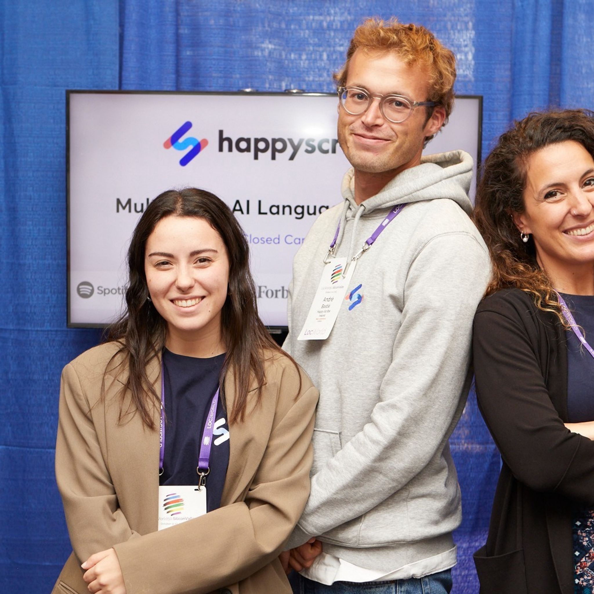
Happy Scribe debuted at LocWorld50, San Jose, highlighting AI's role in reshaping localization and emphasizing the balance between technology and human touch in localization.
André Bastié
·
5 min read

Understanding the concept: what is collaborative captioning and subtitling?
André Bastié
·
3 min read
Delve into the intricacies of interview transcription, from capturing speech details to employing the best editing tools and techniques for polished results.
André Bastié
·
5 min read

Step-by-step guide to transcribing an interview, editing it and using the best software to reach your audience. Get the best interview transcription for journalist, researchers and more.
André Bastié
·
5 min read
Themes and tags are pivotal tools in qualitative research, helping organize and extract vital insights from interview data.
André Bastié
·
5 min read

Interview transcription converts spoken content into written form, with factors like audio quality and length influencing cost; various methods exist, including automated transcription services like HappyScribe.
André Bastié
·
5 min read

Explore the essentials of selecting equipment, recording high-quality interviews, and optimizing the interview transcription process for clarity and accuracy using AI and online software.
André Bastié
·
3 min read
Delving into transcription: From influencing factors to the role of technology and tips for faster processes.
André Bastié
·
4 min read
Maximize your Zoom meetings' potential by converting recordings for accessibility and seamless collaboration.
André Bastié
·
5 min read

Discover the power of Zoom's transcription feature and elevate your virtual meeting experience.
André Bastié
·
5 min read
The shift from in-person to virtual meetings has revolutionized business communication. Dive into the Zoom era and its benefits.
André Bastié
·
5 min read

Discover the critical role of language interpretation in Zoom webinars for inclusive, effective, and global communication.
André Bastié
·
5 min read
Delve into the game-changing world of YouTube subtitles and discover how tools like Happy Scribe can skyrocket your content's impact and reach.
André Bastié
·
6 min read
In our rapidly globalizing world, content producers must bridge linguistic gaps while ensuring accessibility. Subtitles aren't just a tool; they're a necessity. Dive into the significance of subtitling, its potential to captivate global audiences, and discover how tools like Happy Scribe can make it all seamless.
André Bastié
·
6 min read
Harness the power of Happy Scribe for precise transcription, subtitling, and translation, bridging language barriers in global media.
André Bastié
·
8 min read
Harness the power of automation and organization in media libraries, ensuring efficient subtitling and transcription with Happy Scribe's tools.
André Bastié
·
4 min read
Webinar replays have revolutionized how we access, engage, and benefit from online presentations, making Zoom meetings more flexible and inclusive.
André Bastié
·
5 min read
In today's remote-focused world, effective Zoom note-taking is crucial to capture every vital insight during virtual meetings.
André Bastié
·
5 min read

Leverage Zoom's capabilities beyond meetings by mastering its transcription and note-taking potential, enhancing your productivity.
André Bastié
·
5 min read
In today's digital era, translating Zoom recordings is vital for global reach. Using tools like Happy-Scribe, this process is now seamless, ensuring effective communication across diverse audiences.
André Bastié
·
5 min read
Explore voice translation from Zoom recordings using tools like Happy Scribe.
André Bastié
·
2 min read
With the rise of Zoom, many are seeking efficient ways to auto-capture meeting insights. Dive into the world of automatic note-taking on Zoom.
André Bastié
·
5 min read

In the Zoom era, efficient note-taking ensures better decision-making, continuity, and accessibility for meeting attendees. Learn how to optimize this essential task.
André Bastié
·
5 min read

In today's digital era, translating subtitles in Zoom recordings promotes inclusivity. Discover how to achieve this step-by-step with Happy Scribe and other tools.
André Bastié
·
5 min read
AI-powered note-taking tools for Zoom, focusing on the benefits, best practices, and the powerful capabilities of Happy Scribe, a premier Zoom transcription service.
André Bastié
·
5 min read
In 2026, video meetings are paramount; mastering the art of accurate minutes is your ticket to seamless business operations.
André Bastié
·
5 min read

Discover the subtle signs of clandestine recordings and the significance of safeguarding privacy in our digitally entwined world.
André Bastié
·
5 min read
Delve into the pressing privacy concerns of Zoom meetings and the measures to ensure secure digital communication.
André Bastié
·
3 min read

Discover how to seamlessly integrate third-party subtitling services into your Zoom meetings for enhanced communication.
André Bastié
·
5 min read
Harness the power of Zoom's subtitle capabilities to enhance communication, inclusivity, and engagement during virtual meetings and webinars.
André Bastié
·
5 min read
In the evolving digital landscape, Zoom recordings have revolutionized the way we relive and revisit virtual interactions, offering convenience and accessibility across devices.
André Bastié
·
5 min read
Whether for professional collaborations or personal gatherings, knowing how to effectively record Zoom sessions is crucial. With the options of free and paid plans, Zoom caters to a variety of needs, ensuring that no moment is lost.
André Bastié
·
4 min read
Deciphering Zoom's Pricing: Navigating Between Free and Paid Options for Optimal Virtual Collaboration.
André Bastié
·
5 min read
Unlocking the Power of Zoom Rooms: A Deep Dive into Features, Accessibility, and Seamless Integration of Subtitles.
André Bastié
·
5 min read

Enhance Zoom accessibility with subtitles and captions: a step-by-step guide for seamless communication.
André Bastié
·
7 min read

Discover the essentials for ethically recording Zoom meetings, prioritizing privacy and optimizing team collaboration.
André Bastié
·
3 min read
Unlock the power of Zoom subtitles for enhanced communication, inclusivity, and a seamless virtual meeting experience.
André Bastié
·
5 min read

Enhance your Zoom recordings with accurate subtitles using third-party tools for better accessibility and comprehension.
André Bastié
·
5 min read
Discover efficient techniques to trim and enhance your Zoom recordings for a more engaging audience experience.
André Bastié
·
3 min read

Explore the features and benefits of Zoom Meetings, and learn how Happy-Scribe enhances accessibility through accurate transcriptions and captions.
André Bastié
·
6 min read

As Zoom's global prominence rises, the need for comprehensive translation tools in diverse virtual gatherings becomes increasingly paramount.
André Bastié
·
5 min read

Zoom's versatility extends beyond conferencing, with tools like Happy Scribe enhancing its capabilities, especially in transcription services.
André Bastié
·
5 min read

As Zoom transforms global communication, overcoming linguistic barriers becomes paramount, highlighting the need for webinar translations.
André Bastié
·
5 min read

Amidst the digital age, Zoom's rise and its integrated interpretation feature have revolutionized global communication, but third-party translation remains crucial.
André Bastié
·
5 min read

Embrace Zoom, the preferred virtual communication tool, and discover its seamless integration with live translation for globalized meetings.
André Bastié
·
5 min read

Explore the realm of live translation apps for seamless multilingual meetings and events in our digital age.
André Bastié
·
5 min read

In today's digital era, understanding Zoom's diverse offerings—meetings and webinars—is essential for optimized online interactions. This guide elucidates their distinct features and applications.
André Bastié
·
5 min read

Dive into the transformative world of Zoom Webinars with this guide, unlocking the platform's potential for global outreach and engagement in our virtual era.
André Bastié
·
5 min read

Navigate the world of Zoom Webinars with this comprehensive guide, ensuring an enriching experience for attendees in our evolving virtual landscape.
André Bastié
·
6 min read
Explore the comprehensive guide to efficiently sharing Zoom recordings via email, optimizing virtual collaboration in our increasingly digitalized world.
André Bastié
·
5 min read

Discover how to seamlessly integrate Google Translate with your Zoom calls, enhancing communication across various languages for a more inclusive experience.
André Bastié
·
9 min read
Amidst Zoom's surge in popularity, non-host attendees often wonder how they can record sessions. This guide delves into ethical, legal, and technical considerations for non-host Zoom recording.
André Bastié
·
5 min read

Enhance your Zoom experiences by seamlessly recording sessions and transcribing them effortlessly with Happy Scribe. Dive into our detailed guide below.
André Bastié
·
3 min read
Discover how to effortlessly record Zoom sessions on your mobile devices with this comprehensive guide.
André Bastié
·
5 min read

Zoom's rise in remote work is revolutionized by real-time translation, ensuring global inclusivity.
André Bastié
·
3 min read

Zoom: Revolutionizing communication with real-time translation and transcription.
André Bastié
·
5 min read

Vimeo provides unique video-sharing capabilities, prioritizing privacy and quality, making it the choice for professionals and creators.
André Bastié
·
5 min read
In the digital age, privacy reigns supreme; Vimeo steps up, ensuring users have unparalleled control over their video content.
André Bastié
·
3 min read

Amidst global shifts, Zoom meetings dominate; but the real magic? Turning those spoken words into accessible text.
André Bastié
·
5 min read

Preserve essential Zoom conversations with accurate, easy-to-use transcription services like Happy Scribe.
André Bastié
·
6 min read

Unlock the power of Zoom transcriptions to optimize remote interactions, ensuring every critical detail is captured and easily accessible.
André Bastié
·
6 min read
Discover how to effortlessly record, retrieve, and enhance your Zoom meetings, ensuring no valuable discussion goes unnoticed.
André Bastié
·
5 min read
Master the art of downloading and preserving your Zoom meetings with this step-by-step guide to optimal recording methods.
André Bastié
·
5 min read

Discover how to effortlessly record Zoom meetings on Apple iCloud across various devices, ensuring seamless access and robust security.
André Bastié
·
6 min read

In 2020, Zoom's recording feature revolutionized meeting documentation, enhancing efficiency and accessibility.
André Bastié
·
5 min read
Navigate, manage, and enhance your Zoom recordings with ease through this guide, which also introduces Happy Scribe's transcription services.
André Bastié
·
4 min read
Enhance video content with customized subtitles through Happy Scribe, a tool that offers quality and personalized branding for global audiences.
André Bastié
·
7 min read

Learn how to enable language interpretation in Zoom meetings using Happy Scribe with this step-by-step guide, enhancing global communication.
André Bastié
·
5 min read

This guide provides step-by-step instructions for recording Zoom meetings and webinars without cost, enhancing online collaboration and learning.
André Bastié
·
5 min read
Zoom's transcription feature allows easy conversion of video meetings into text, aiding communication in various professional and personal settings.
André Bastié
·
7 min read

Understanding Zoom's transcription feature is essential in today's virtual world. This article explains the what, why, and how of Zoom transcription, including third-party service integration.
André Bastié
·
3 min read

Explore the intricacies of transcription authorization within Zoom, the role of hosts in meetings and webinars, and how tools like Happy Scribe can enhance virtual communication.
André Bastié
·
5 min read

Learn how to integrate Zoom and Google Drive for seamless storage and sharing of video recordings, and discover the benefits of this connection, including Happy Scribe's transcription service.
André Bastié
·
6 min read

Navigating Zoom Cloud storage limits is essential for users of this popular video conferencing tool. This article guides you through managing and understanding storage capacity and offers practical solutions.
André Bastié
·
5 min read
Zoom recordings serve various purposes, from information retrieval to correspondence. Understanding how to locate, replay, and recover these files, and maximizing their use, can be invaluable.
André Bastié
·
5 min read
Zoom Cloud offers users a way to store and manage their virtual meetings securely. This post guides you through accessing, locating, sharing, and transcribing Zoom Cloud recordings.
André Bastié
·
3 min read

Explore the features and benefits of Zoom Cloud, including how to record, store, and transcribe meetings, with this comprehensive guide to cloud-based recording on Zoom.
André Bastié
·
5 min read

Concerned about Zoom recording expiration? This article guides you on retaining Zoom recordings, accessing expired files, and changing retention settings for both local and cloud storage.
André Bastié
·
4 min read
Learn how to export Zoom recordings to your computer, cloud storage, or through third-party tools with this step-by-step guide for sharing and archiving virtual meetings.
André Bastié
·
5 min read
This guide offers various methods to convert Zoom files to MP4, ensuring compatibility and ease of sharing, with options for both Windows and Mac.
André Bastié
·
5 min read

Learn how to share Zoom recordings through various methods and enhance collaboration, with a step-by-step guide including Happy Scribe services.
André Bastié
·
5 min read
Discover methods to record Zoom meetings without host permission and understand the legal considerations and alternatives for capturing content.
André Bastié
·
5 min read
Enhance your Zoom meetings with live transcription. It ensures clarity and inclusiveness, even when technical or linguistic barriers arise.
André Bastié
·
6 min read

This guide explores the specifics of Vimeo, including memberships, video preparation, file formats, transcription, and subtitles, to help creators optimize their content.
André Bastié
·
6 min read
Is downloading Vimeo videos legal? This article explores the legality and methods of downloading content from Vimeo, a leading video platform.
André Bastié
·
7 min read

Concerned about missing or deleted videos on Vimeo? This article covers how long videos are stored, deletion reasons, and recovery methods.
André Bastié
·
6 min read
Navigating the need for Zoom transcripts? This post offers insights and resources to help you easily record and access transcripts on your PC.
André Bastié
·
6 min read
Explore comprehensive steps to send Zoom transcriptions via email, ensuring seamless communication and effective documentation of your meetings and webinars.
André Bastié
·
5 min read

Struggling with tracking online meetings or wondering about transcription services? Explore Zoom transcription prices, methods, and how Happy Scribe can be your efficient solution.
André Bastié
·
5 min read
Discover how to convert Zoom transcripts into Word documents using automatic transcription tools like Happy Scribe. Enhance efficiency, communication, and record-keeping for your meetings.
André Bastié
·
6 min read
Happy Scribe: Your essential tool for transcription and subtitling, empowering media teams to overcome language barriers and connect with global audiences efficiently and effectively."
André Bastié
·
6 min read
Wondering how to make a professional video with a minimum effort? Read for some tricks and video editing tips to help you create a great quality video project!
André Bastié
·
5 min read

Transcripts, students' best friends, enhance online learning through accurate note-taking, easy archiving, effective studying, and collaborative efforts, revolutionizing education in the digital age.
André Bastié
·
5 min read

Increasing eLearning accessibility and efficacy, transcripts are textual representations of course content, aiding student retention, searchability, catering to diverse learning styles and improving SEO.
André Bastié
·
5 min read

Learn how to add captions to LMS platforms for enhanced content accessibility, learner comprehension, and inclusivity in E-learning.
André Bastié
·
6 min read

Explore the untapped potential of transcription in elevating the effectiveness and inclusivity of today's e-learning landscape.
André Bastié
·
6 min read

Select the 'Quiz' option in our 'AI Assist' to automatically create questions for your quiz!
André Bastié
·
5 min read
Subtitling boosts social proof, reduces backlash, and enhances accessibility, bolstering online presence. This piece examines its benefits, citing French E-learning platform Skilleos as a case study.
André Bastié
·
5 min read
Creating accessible E-learning videos can be a complex task. Happy Scribe simplifies the process by offering transcription, subtitling and customizable features, ensuring an engaging learning experience for everyone.
André Bastié
·
6 min read

Subtitling for e-learning improves accessibility and comprehension by providing a text version of audio content. It involves transcribing, timecoding, editing, and formatting captions, syncing them with visual content. This process enhances learning experiences and ensures inclusivity for all learners.
André Bastié
·
6 min read
Discover the vital role of captions in e-learning accessibility, and explore the differences between closed and open captions to decide the best fit for your courses. Uncover the significance of popular platforms like Netflix and Google in championing captioning, as well as legal regulations to ensure inclusivity.
André Bastié
·
6 min read

In this article, we delve into accessibility challenges within the e-learning industry, and present strategies for creating inclusive online learning environments.
André Bastié
·
7 min read

Discover how to enhance accessibility in e-learning by adding subtitles to Loom course videos using the powerful and user-friendly platform, Happy Scribe.
André Bastié
·
5 min read

Discover the importance of localizing e-learning courses for global audiences, understanding key elements, steps, and best practices for effective localization.
André Bastié
·
5 min read

Explore the benefits of using YouTube for e-learning, understand how to effectively incorporate it into your courses, and learn about the potential of YouTube Shorts for educational content with HappyScribe.
André Bastié
·
5 min read

Explore the benefits of including transcripts in e-learning videos, from improved accessibility and comprehension to SEO advantages and legal compliance, and discover effective integration tips.
André Bastié
·
5 min read
Discover how Happy Scribe is the ideal alternative for Dotsub’s discontinued transcription and subtitling services in this comparative review.
André Bastié
·
5 min read

Discover how Happy Scribe's Make With AI transforms transcripts into professional emails.
André Bastié
·
5 min read
This article provides a comprehensive guide on how to maximize the Make With AIBlog post feature, improving blogging capabilities and efficiency.
André Bastié
·
5 min read

Explore how Vimeo Library helps manage and share videos, its diverse pricing plans, and integration with Happy Scribe for transcription.
André Bastié
·
5 min read
Dive into how subtitles and transcription can boost e-learning accessibility, engagement, and effectiveness for diverse learners.
André Bastié
·
8 min read

Here's your quick guide to making e-learning more accessible: learn to create and use SRT or VTT files for video captions
André Bastié
·
25 min read

Dive into the world of SRT subtitles on Vimeo, and learn how they boost video engagement, accessibility, and SEO
André Bastié
·
45 min read
Master the art of capturing Vimeo videos for offline viewing or improved communication, with this handy guide.
André Bastié
·
5 min read

Score more viewers by making your Vimeo videos downloadable, and this guide shows you how to do it.
André Bastié
·
5 min read

Dive into this handy guide to learn how to download Vimeo videos in mp4 format for offline use, using both direct and third-party methods.
André Bastié
·
5 min read

Explore how Happy Scribe's translation tool can revolutionize your content creation process, making Vimeo live videos more accessible and engaging.
André Bastié
·
5 min read

Highlighting the importance of captions and translations, this article provides a detailed guide to video translations on Vimeo for global content accessibility.
André Bastié
·
5 min read
Diving deep into Vimeo's free and paid streaming options and their integration with Happy Scribe, we explore benefits and features for content creators.
André Bastié
·
5 min read

Master the art of language switching on Vimeo with Happy Scribe to make your videos globally accessible, in 13 easy steps.
André Bastié
·
5 min read

Our quick guide to uploading, captioning, and translating your Vimeo videos, manually or with Happy Scribe's help, for a global audience.
André Bastié
·
5 min read

Get the lowdown on using Vimeo for live streaming, engaging real-time audiences, and upping your video game with cool features like Happy Scribe subtitles.
André Bastié
·
5 min read

Bust language barriers on Vimeo by enhancing your videos with subtitles via Happy Scribe, with this step-by-step guide.
André Bastié
·
5 min read
Master the art of making your Vimeo videos globally accessible with subtitles and captions, and don't worry, Happy Scribe's got your back!
André Bastié
·
5 min read
Discover how to make the most of Vimeo Record, a versatile tool for screen recording, even when live streaming doesn't fit your schedule
André Bastié
·
5 min read

This article provides a step-by-step guide to set up and enjoy live streaming on Vimeo, emphasizing interactivity and viewer engagement.
André Bastié
·
5 min read
This article is your go-to guide for converting Vimeo videos into audio files, with reasons why you might want to do it and the best third-party tools to make it happen.
André Bastié
·
5 min read

This article provides a comprehensive guide on optimizing your Vimeo video uploads for best quality and experience, highlighting the importance of choosing the right video format.
André Bastié
·
5 min read

Live streaming on Vimeo is a breeze: sign up, customize your account, create an event, tweak live settings, and go live!
André Bastié
·
5 min read
Experience interactive and high-quality live video streaming with Vimeo Live, offering an easy-to-navigate platform and features for audience engagement.
André Bastié
·
5 min read
Explore the diverse range of Vimeo plans catering to personal users, video artists, small businesses, and large corporations
André Bastié
·
5 min read

Vimeo, cherished for its high-quality streaming and flexible storage options, offers a comprehensive video-sharing platform with unique features such as customizable branding
André Bastié
·
5 min read

The Vimeo Video Library, designed for collaborative workspaces, offers organizations a secure and organized platform to share and manage videos, with features such as automatic transcription
André Bastié
·
5 min read
While both YouTube and Vimeo are popular video-sharing platforms, Vimeo provides more comprehensive privacy settings and maintains higher video quality, but YouTube has a larger audience.
André Bastié
·
5 min read

Downloading Vimeo videos requires a paid account and, for user-created content, enabling the download option, but third-party options exist.
André Bastié
·
5 min read

Vimeo offers an accessible, SEO-enhanced, and high-quality platform for video hosting and sharing.
André Bastié
·
5 min read
Vimeo, established by filmmakers and preferred by creative professionals, offers high-quality video hosting and sharing, customizable players, advanced analytics, and integration with transcription services.
André Bastié
·
5 min read
Vimeo offers a transcription service which transcribes spoken language into written text, making videos more accessible
André Bastié
·
5 min read

This article discusses the advantages and distinctive features of Vimeo's transcription service, which enhances video accessibility, aids in SEO, and attracts a broader audience.
André Bastié
·
5 min read
Learn how to download transcriptions from Vimeo to improve accessibility, SEO, and audience engagement. Follow our step-by-step guide or use tools like HappyScribe to convert and edit files.
André Bastié
·
6 min read

This article provides a detailed guide on creating and applying subtitles to Vimeo videos, discussing various subtitle formats supported by Vimeo and the steps to generate subtitles.
André Bastié
·
5 min read
Not sure how to add subtitles to a YouTube video? In this article you will find some of the best and easiest ways to add captions to videos.
André Bastié
·
5 min read
This article provides guidance on why Vimeo videos may be deleted and outlines the different recovery methods available, whether through Vimeo's platform or utilizing device-level data recovery tools, to assist users in retrieving their lost content.
André Bastié
·
5 min read
This article outlines various methods for copying Vimeo videos, whether you're a creator using Vimeo Create or a viewer seeking to download, screen record, or use third-party solutions, all while emphasizing adherence to Vimeo's content sharing rules.
André Bastié
·
5 min read

This article provides a comprehensive guide on finding and utilizing English subtitles on Vimeo,
André Bastié
·
5 min read

Vimeo offers diverse options for adding subtitles to videos, and when issues arise, such as unsupported formats or incorrect coding, Vimeo provides straightforward troubleshooting steps, ensuring content is accessible and reaches a broad audience.
André Bastié
·
5 min read
Vimeo offers various methods for translating videos, including automatic captions, machine translation technology, professional manual translation services, and support for third-party apps like Happy Scribe, ultimately enhancing video accessibility, SEO, and user experience for a global audience.
André Bastié
·
5 min read
Improve the accessibility, visibility, and user experience of your Vimeo videos with transcriptions, boosting views and providing clearer messaging.
André Bastié
·
5 min read
To transcribe live Zoom meetings without recording, one can use tools like Zoom's Live Transcription and Happy Scribe, each offering unique features like closed captions, easy note-taking, or speaker identification."
André Bastié
·
5 min read

Explore how Happy Scribe, an AI-powered transcription tool, can effortlessly convert Zoom recordings into text-based transcripts, benefiting interviews, video subtitles, captions, and academic lectures while offering affordable plans.
André Bastié
·
5 min read

Discover how to convert Zoom recordings into text-based transcripts using transcription tools like HappyScribe and Rev.com, allowing easy access, sharing, and reference of meeting contents.
André Bastié
·
6 min read

This guide presents the best apps for transcribing Zoom meetings including Happy Scribe, Otter AI, Fireflies AI, Rev, and Colibri, emphasizing their unique features and benefits while highlighting best practices for improved transcription accuracy.
André Bastié
·
5 min read
Happy Scribe is a top-tier transcription software lauded for its high accuracy, ease of use, cost-effectiveness, robust features, seamless integrations, outstanding customer support, and user-friendly interface.
André Bastié
·
5 min read
This guide covers how to transcribe Zoom meetings and webinars using Zoom's in-built transcription service and third-party transcription services.
André Bastié
·
26 min read
This guide outlines the need for accurate live transcription services during Zoom webinars and presents several options including Zoom's Live Transcription, Otter AI, Colibri, Rev, Verbit, and Happy Scribe, each offering unique features and benefits.
André Bastié
·
4 min read

Discover how to simplify the process of navigating through lengthy transcripts by creating chapters with Happy Scribe's AI transcription tool, enhancing readability and productivity across various professions.
André Bastié
·
5 min read

This article explains how Happy Scribe's Make With AI tool can make your life easier by automatically summarizing your transcriptions into short, medium, or long summaries, saving you both time and money.
André Bastié
·
5 min read

Dive into the differences between SDH and closed captions, and discover how Happy Scribe can revolutionize your video accessibility with automatic, customizable, and multilingual transcriptions.
André Bastié
·
5 min read

Discover how to effectively use Vimeo video transcription for interviews. Learn the step-by-step process of transcribing interviews on Vimeo and the benefits it brings.
André Bastié
·
5 min read
Discover the benefits of captions, including increased accessibility, broader audience reach, improved attention retention, and easier content navigation.
André Bastié
·
5 min read

Learn how to transcribe audio on Vimeo and make your videos more accessible. Explore the steps to obtain video and audio transcriptions using services like Happy Scribe.
André Bastié
·
5 min read
Easily enhance your Vimeo video experience by adding subtitles. Learn how to download Vimeo videos and their corresponding subtitle files, and discover different methods for playing videos with subtitles.
André Bastié
·
5 min read

Discover how Vimeo video transcription optimizes user experience by improving accessibility, enhancing user understanding, enabling content searchability, and allowing viewers to watch without audio.
André Bastié
·
5 min read

Adding subtitles to videos can increase audience engagement, improve accessibility, and help promote a positive image of a company, making it a useful tool for job postings and promotions.
André Bastié
·
5 min read

Transcription platforms automatically convert speech into text files or have human transcriptionists type out the video’s audio to text. We discuss the most important platforms.
André Bastié
·
5 min read

Learn how to add subtitles and captions to Vimeo videos in a straightforward and efficient way with this article.
André Bastié
·
5 min read

Learn why subtitles don't always appear on Vimeo, how to enable them, and how to add your own captions and subtitles or use third-party software to create transcriptions in different languages.
André Bastié
·
5 min read

Third-party transcription tools offer highly accurate transcripts written by human transcriptionists. Users can upload their video transcription files to Vimeo by creating an account with a transcription service, ordering the transcription, downloading it, and uploading it to Vimeo.
André Bastié
·
5 min read

Happy Scribe offers fast and accurate closed captioning and translation services for Vimeo videos. Adding subtitles to videos on Vimeo increases accessibility, broadens the audience, and improves viewer engagement
André Bastié
·
5 min read
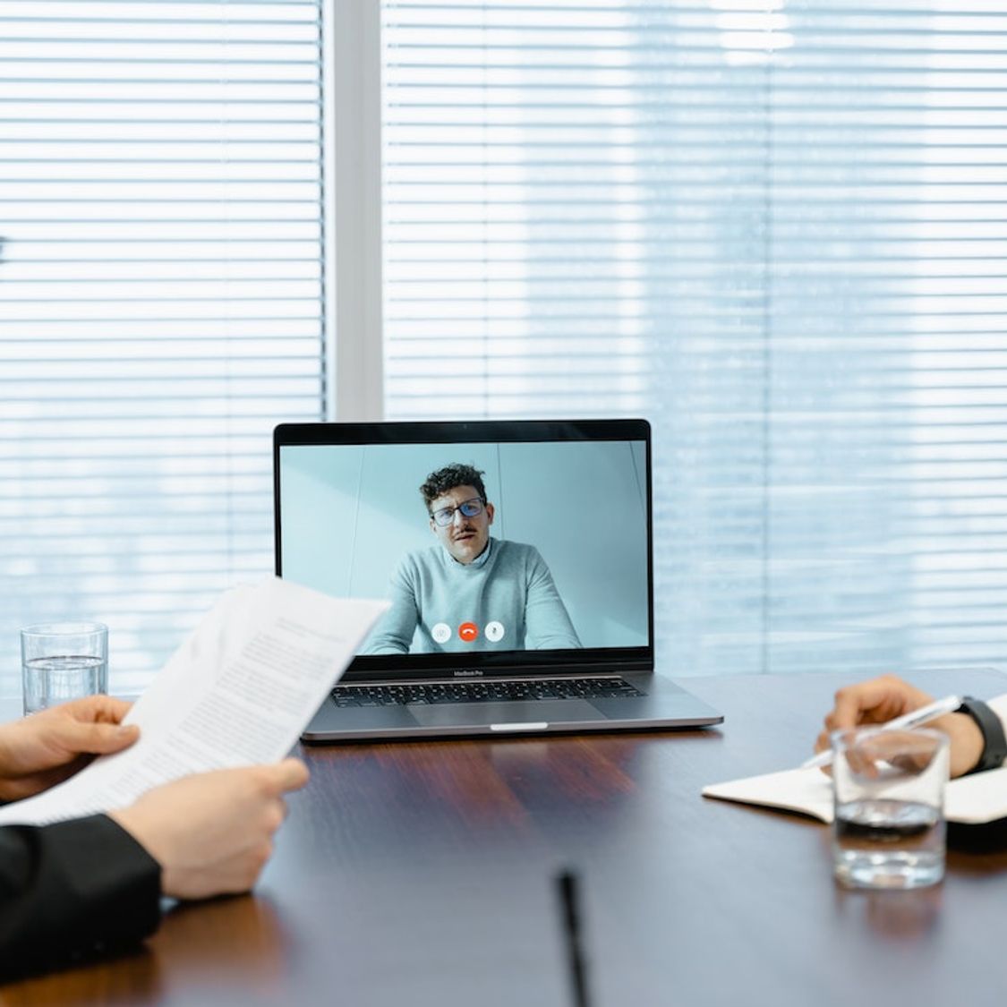
Transcribing Zoom meetings using a third-party application increases engagement, inclusivity, and comprehension while making content searchable and better documented. Third-party transcription apps offer greater accuracy, ease of use, readability, time savings, and extra features like automatic summaries and language support.
André Bastié
·
5 min read
Transcription tools efficiently convert Zoom video recordings into Microsoft Word, increasing productivity. Some popular tools offer varying features, supported languages, and pricing. These tools make transcription easier with features like advanced punctuation, speaker recognition, and customizable templates. Choosing the right tool depends on project type, frequency of use, budget, transcript accuracy, and turnaround time.
André Bastié
·
5 min read

Transcribe Zoom video recordings for free using tools like Happyscribe. These tools use AI and natural language processing to convert speech to text, enabling easy reference and storage. Factors to consider when selecting a transcription service include accuracy, turnaround time, cost, and compatibility with other platforms. Happyscribe stands out for its features, integrations, and ease of use, making it a top choice for transcribing Zoom recordings.
André Bastié
·
5 min read
Zoom Live Transcription offers basic automatic transcriptions, while Happy Scribe provides more accurate, professional results with a free trial. Other tools are available: evaluate options based on your transcription needs and desired accuracy.
André Bastié
·
5 min read

Transcription tools for Zoom meetings and webinars vary in price and accuracy, depending on whether they are machine-generated or human-generated. Machine-generated transcripts have an 80-85% accuracy rate and cost around $0.25 per audio minute, with monthly plans ranging from $8-$30. Human-generated transcripts boast a 99% accuracy rate but cost around $1.50-$3 per minute.
André Bastié
·
5 min read
Looking for the best captioning software of 2026? We tested the top AI and human transcription tools for accuracy, speed, and price. See why HappyScribe is our #1 pick.
André Bastié
·
2 min read

Audio to text and video to text transcriptions of conference speeches offer many versatile ways to improve your conference.
André Bastié
·
2 min read
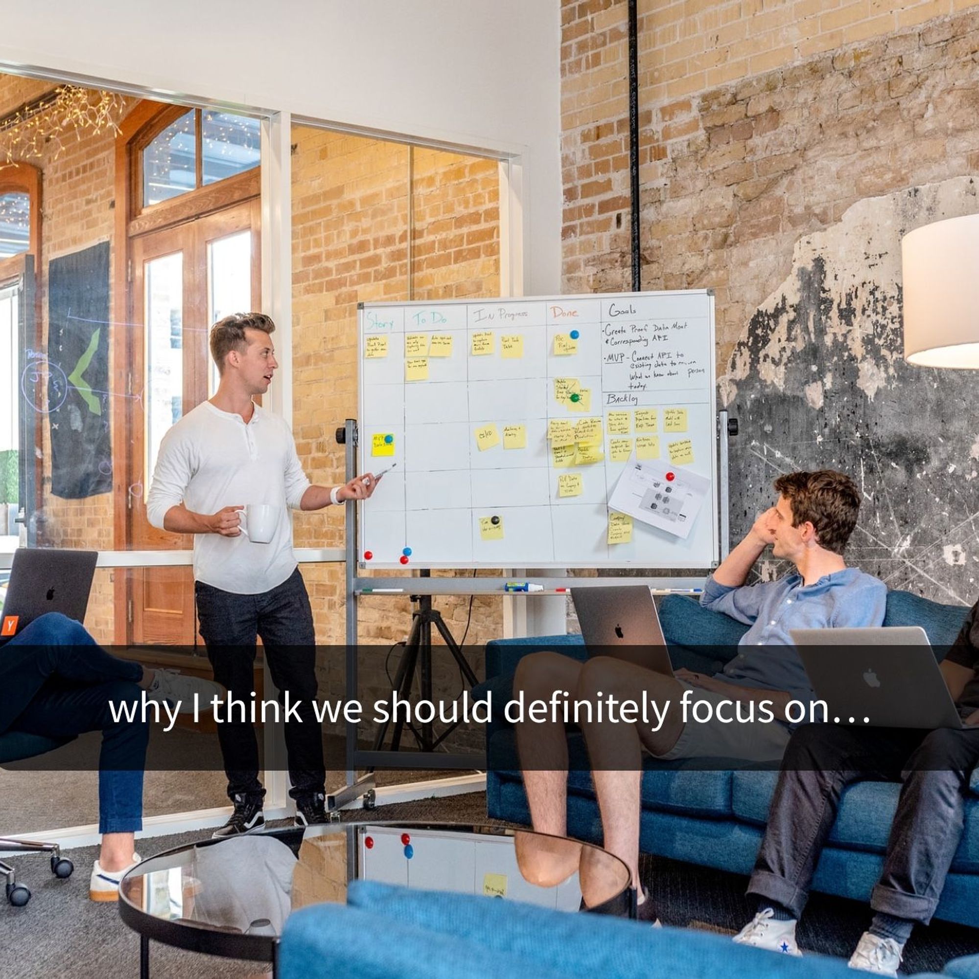
Your subtitles need to be readable and perfectly synced with the video and perfectly follow the reading skills of your audience. For example, you don't make subtitles for adults the same as subtitles for children.
André Bastié
·
2 min read
Creating a money-generating eBook from your existing podcast episodes shouldn’t take too long. Just follow these six simple steps.
André Bastié
·
2 min read

What are the pros and cons of recording and note-taking? Which one is right for you?
André Bastié
·
2 min read

In this post we analyse the best ai transcription software you can use in 2026 to auto generate transcripts. Compare the best tools for transcription available in the market.
André Bastié
·
2 min read

Seven practical solutions audio and video creators can implement to make web content more accessible for the Deaf and hard of hearing.
André Bastié
·
2 min read

Getting insightful data from any focus group begins with meticulous pre-planning. Start by asking these five essential questions.
André Bastié
·
2 min read
Did you ever wonder if they were an iPhone application that was able to record and transcribe the audio into text at the same time?
André Bastié
·
2 min read

Increasing your GPA is easy when you record and transcribe your lectures. Here is how audio to text technology can help you.
André Bastié
·
2 min read
How do you get a quality audio recording on your smartphone? Follow these simple steps. Better audio means a more accurate automatic transcription.
André Bastié
·
2 min read
How do you get accurate subtitles and captions on your Facebook page videos? It is actually easier than you think. Here is an easy step-by-step guide to follow.
André Bastié
·
2 min read
Transcribing your Instagram stories is great way to improve your SEO and maintain strong Google Search rankings for your videos. Instagram stories are one of the most popular features of Instagram, but most aren’t accessible to deaf and hard of hearing people. So what to do? How do you
André Bastié
·
2 min read
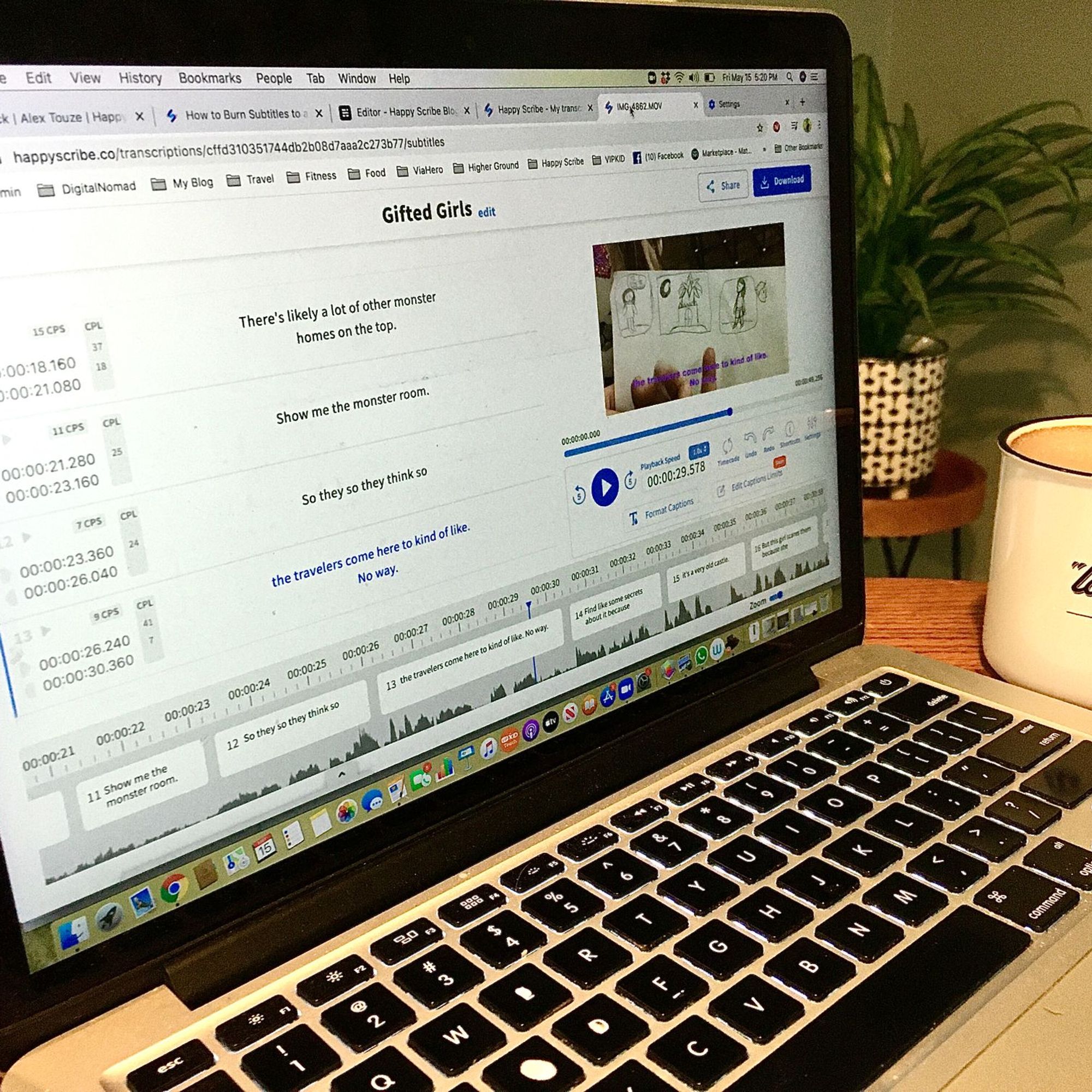
Creating a WebVTT subtitle file is lightening fast with Happy Scribe's Subtitle Generator. This tutorial shows you how.
André Bastié
·
2 min read

There are two easy ways to convert audio cassette tapes to a digital format such as MP3. Happy Scribe shows you how.
André Bastié
·
2 min read

Creating minutes of a meeting doesn't have to be time-consuming. Use an automatic transcription service provider to get meeting minutes accurately and quickly.
André Bastié
·
2 min read
Staff burn-out and high costs by trying to manually transcribe over 1500 radio broadcasts stored in the Library and Archives Department. As a result of using Happy Scribe’s services, Biola University was able to reduce their costs by 80%.
André Bastié
·
2 min read

Follow these simples steps to get the most from recording and automatically transcribing your academic lecture.
André Bastié
·
2 min read
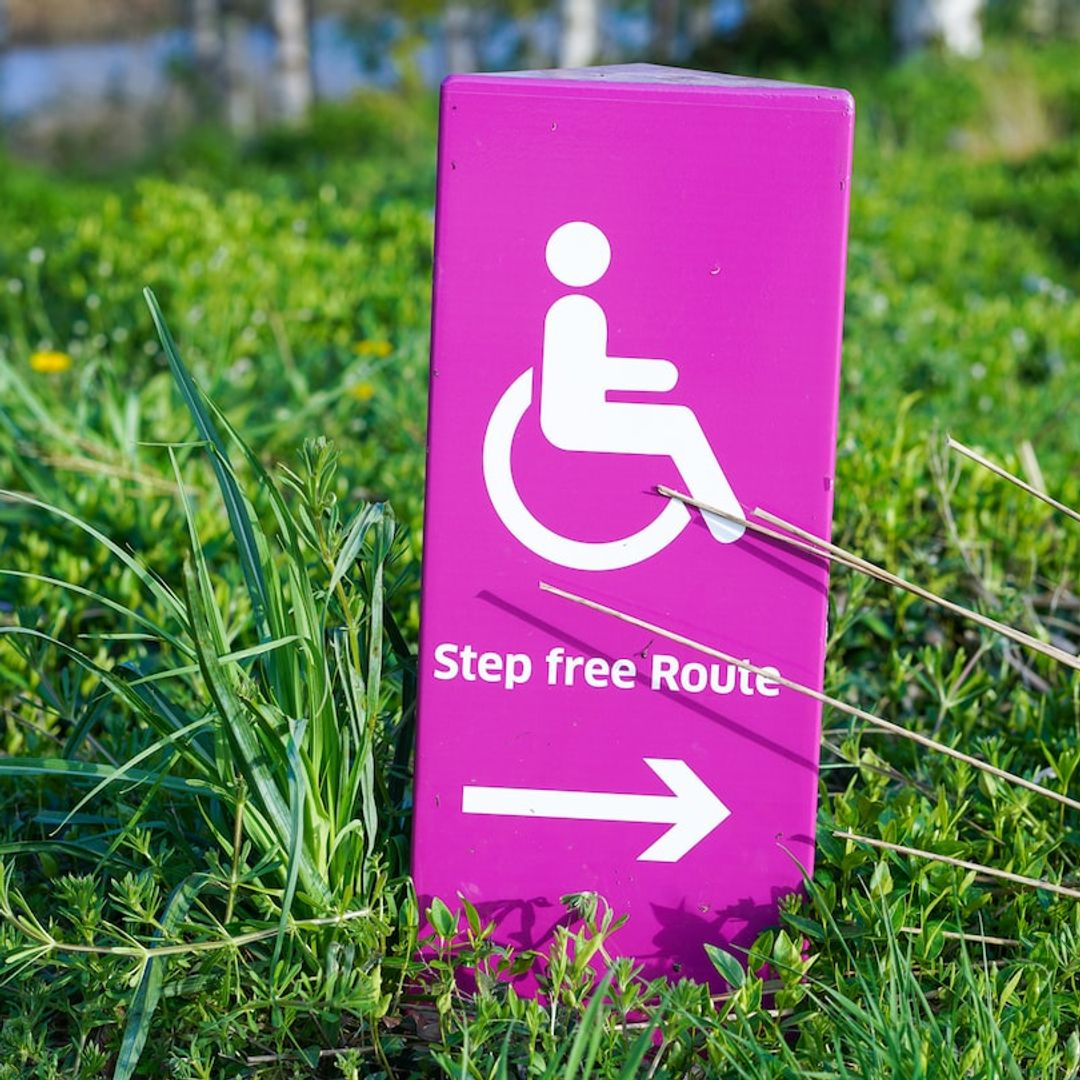
Use Happy Scribe's handy checklist to see if your video is accessible.
André Bastié
·
2 min read
Six criteria to consider when choosing which transcription method is best: manual, automated transcription service provider, or human-based.
André Bastié
·
2 min read

Thinking of creating a how-to video Follow these six steps to create the perfect how-to video and you will increase your viewership and boost your SEO in no time.
André Bastié
·
2 min read
LINC (Leadership for INCLusion in the Early Years) is an higher education level programme which enables practising early years’ educators to support the inclusion of children with additional needs in their early years of education. LINC has grown to be Ireland’s largest blended learning cohort in higher education offering
André Bastié
·
2 min read
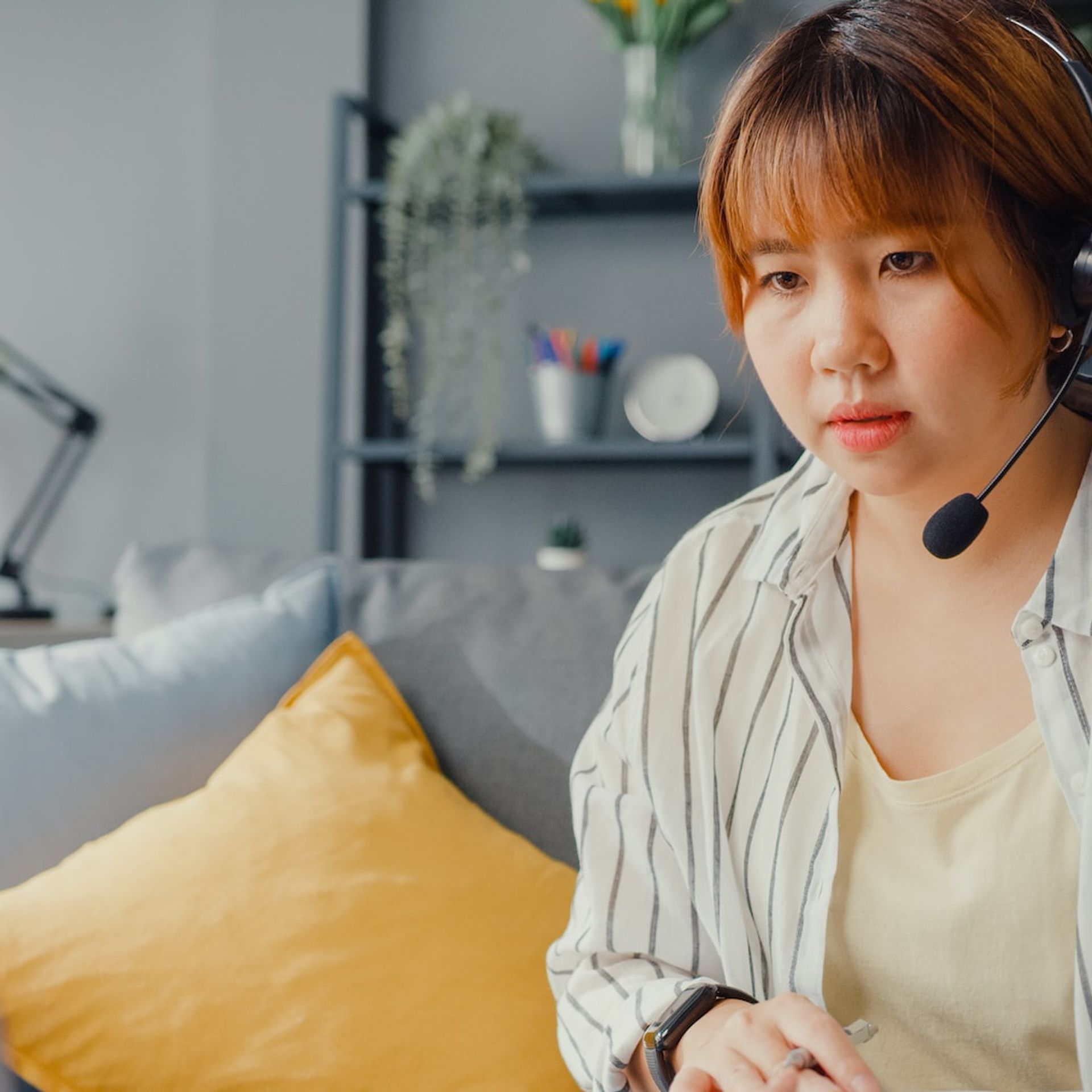
Have you ever wondered, 'What is the difference between transcription and translation?' If so, read on.
André Bastié
·
2 min read
Being efficient and saving time is the key to success for any video editor. Use these 5 productivity hacks to help you stay focused, work faster, edit smarter and stream-line your post-production approach.
André Bastié
·
2 min read
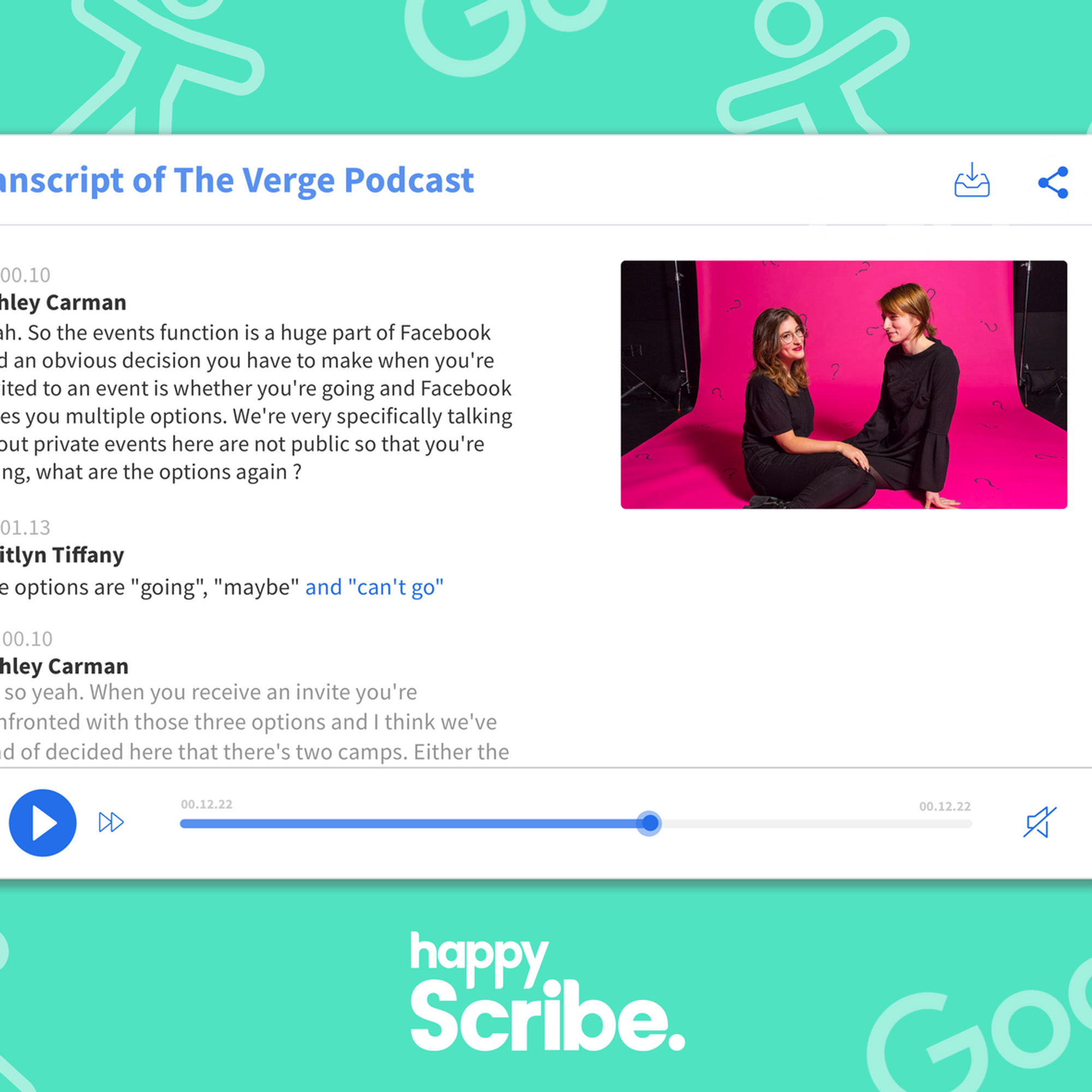
Our Embed Player is out of service
André Bastié
·
2 min read
Whether you are a professor who records oral histories for your research or a market researcher looking to document the conversations that took place during your most recent focus group, Happy Scribe’s transcription services allow us to easily transcribe your audio files to text in just a few minutes.
André Bastié
·
2 min read
These tips will provide you a better quality audio recording, which will in turn increase your audio-to-text transcription accuracy.
André Bastié
·
2 min read
Crafting quality show notes has many benefits, but creating them doesn't have to be time-consuming. We show you the benefits and how automatic transcription can speed up the process.
André Bastié
·
2 min read
Learn how to record and transcribe a Google Hangouts Meet video in any language: French, Spanish, German, Arabic, Italian or +114 other languages and accents.
André Bastié
·
2 min read
Have you ever received a WhatsApp voice message that you would rather read? Here we explain how you convert a WhatsApp audio to text. And we explain why voice messages are becoming popular again.
André Bastié
·
2 min read
Are you a video editor transcribing video audio to text? Make sure you are avoiding these these common mistakes.
André Bastié
·
2 min read

There is a quick and cost-effective way to ensure that online courses are accessible to all: add captions to Blackboard videos. Happy Scribe shows you how.
André Bastié
·
2 min read

Including transcripts with e-Learning videos helps improve the overall learning experience for both learners and teachers. Here's how.
André Bastié
·
2 min read
High-quality recordings are essential to transform an interview into a high-quality transcription. To achieve crystal clear sound quality invest in this essential equipment.
André Bastié
·
2 min read
We’ve reviewed dozens of productivity tools on the market and provide you with our list of the most essential productivity tools for podcasters.
André Bastié
·
2 min read
Adding subtitles to your LinkedIn video posts is a simple process. Happy Scribe shows you how.
André Bastié
·
2 min read
Voice recognition is the ability of a machine or program to identify words and phrases in spoken language and convert them to a machine-readable format. Designing a machine that mimics human behavior, especially the capability of speaking and responding to it, has intrigued engineers and scientists for centuries. Speech technologies
André Bastié
·
2 min read
There is nothing quite like enjoying a good film, series or documentary, and really getting immersed in the story. But what happens when that great piece of art is not in a language you can understand? And what happens when you can see the video but physically can’t hear the audio? That’s where subtitles and closed captions (CC) come in. Both bits of timed on-screen text offer language access and language accessibility, supporting a full viewing experience, but they do so in different ways. In this article we are going to explain how.
Henni Paulsen
·
2 min read
Using YouTube's automatic captioning service is tempting: it's free. However, there are some serious limitations to consider.
André Bastié
·
2 min read

SDH subtitles ensure that video content can be accessed by the entire Internet population. Happy Scribe discusses their attributes and why you should use them.
André Bastié
·
2 min read
These tips and techniques will help ensure that you conduct a professional interview and help you get meaningful information and useable quotes.
André Bastié
·
2 min read
If you’re one of the many freelance writers that makes up the ‘gig economy’, you’re in good company. Latest figures suggest that there’s 2 million freelancers in the UK, most of whom work in professional and technical occupations – namely writing. As self-employment has grown, so has the
André Bastié
·
2 min read

Conference rooms around the world are now in darkness, with many businesses relying on virtual meetings to stay connected. Follow these tips to host, record and transcribe a successful virtual meeting.
André Bastié
·
2 min read
Five important software tools for podcasters.
André Bastié
·
2 min read
For documentary producers, it can be very important to create markers to fast-track the editing process. Postproduction and production companies can use Happy Scribe to fast-track their projects. Creating transcripts is making the post-editing process much more efficient. However, when you have dozens if not hundreds of recording hour to
André Bastié
·
2 min read

Two weeks ago we question ourselves on what happy scribers were doing with the transcripts ordered on Happy Scribe. We saw that the final purpose of most transcriptions was to have a basis to collaborate with peers. So, here we are, today, we are releasing Happy Scribe for Teams.Teams
André Bastié
·
2 min read
An SRT file allows video editors to insert subtitles or closed captions. Learn how to easily create a custom SRT file.
André Bastié
·
2 min read

Video calls and meetings are essential in the business world, but language barriers can be a challenge. Zoom's transcription service helps bridge the language gap, supporting a variety of languages for live transcription. While the accuracy of Zoom's captions is generally high, it lacks a dictionary tool, leading to occasional errors with names, acronyms, and content-specific terms. Additionally, Zoom's supported languages are limited to 22, which may not cover all users' needs.
André Bastié
·
5 min read